11 Simple Fixes to Improve Conversion Rates

Your website isn’t performing. It’s not earning the kind of leads, sales, or sign-ups you want. Don’t feel bad, though. Every website has room for improvement. Here are 11 things you can do to improve conversion rates on your website without breaking the bank.
Do any of these situations sound familiar?
- You need your website to perform better, but you’re not ready for a full
redesign Your current website is still fairly new- You don’t have the budget for an overhaul right now
- Your team simply can’t take on that kind of project right now
- Maybe you’ve decided you shouldn’t redesign your website in the first place
The good news is you don’t need a completely new website in order to improve conversion rates, earn more leads, and pull in more revenue.
11 Quick and Easy Ways to Improve Conversion Rates
There are plenty of things you can do today to considerably improve website performance and increase conversion rates. Low-hanging fruit exist on every website. Some of the tasks
Let’s begin.
Section One: Your Homepage (Above the Fold)
The most valuable real estate on your website is the area of your homepage that shows before a visitor scrolls. More people see the top area of your website homepage than anything else. For many visitors, if that area isn’t clear and compelling, they won’t ever look at anything else.
That area is ripe for easy optimizations.
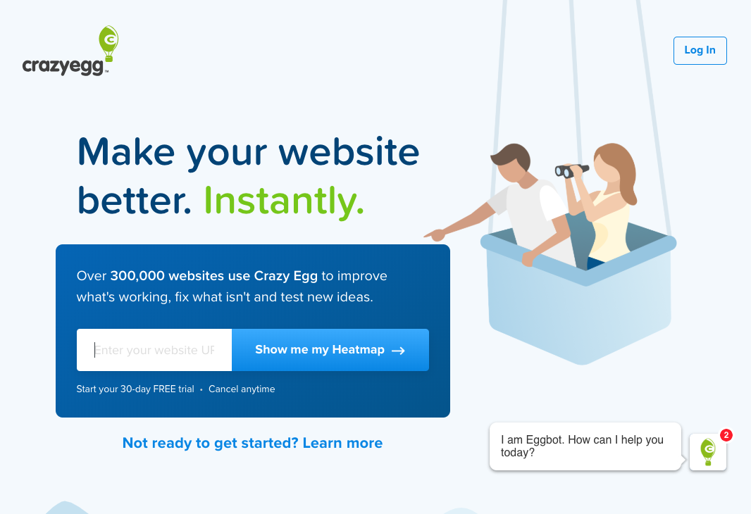
Low Hanging Fruit #1 – Say What You Do
Don’t assume your visitor knows who you or what you do because many of them won’t. Even visitors who are familiar with you benefit from a clear reminder of what you can do for them.
Rewrite your homepage headline and sub-headline so that if someone read those two things and nothing else they will understand what your organization does and why they should be interested. Don’t force them to find an “About” or “What we Do” page before they know whether you are what they’re looking for. Conversely, don’t over-explain everything either.
Improve clarity, increase conversions.
Low Hanging Fruit #2 – Tell Visitors What to Do
What happens when a visitor successfully figures out what you do and is interested? What do they do next?
If your website doesn’t clearly communicate what you want them to do next, chances are they won’t. Do you want them to sign up for an email list? Book an appointment? Request a quote?
Figuring it out should not feel like a scavenger hunt for your visitors. Write clear calls-to-action to help users understand what you want from them. When in doubt, add a button and tell them what to do.
Low Hanging Fruit #3 – Get Rid of That Slideshow
Homepage slideshows make it very difficult to clearly communicate who you are and what you do (see Low Hanging Fruit #1). They make it confusing for people to understand what to focus on.
For most websites, a fixed homepage hero area will outperform any slider. If you have multiple things you want to communicate, break them out of the slider and include them somewhere else.
If you have a slider on your homepage, explore alternative ways to display that information.
Section Two: Trust Indicators
Your industry is full of people who don’t know what they’re doing. You’re not one of them. The question is, how do people who don’t know anything about you distinguish you from the amateurs?
Before someone will buy from you they have to trust you. Here are a few ways to indicate that you’re a trustworthy organization.
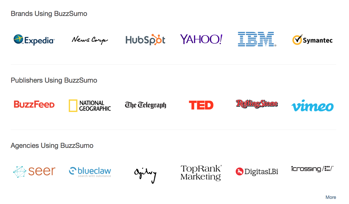
Low Hanging Fruit #4 – Authority
How do visitors know you’re legitimate? A simple way is to prominently feature the logos of recognizable organizations you work with. Maybe they’re clients, publications you’ve written for, or key partners. Or maybe the logos highlight your certifications and accreditations. Either way, recognizable third-party logos are visual shorthand for “we’re not a scam.”
Low Hanging Fruit #5 – Testimonials…Everywhere
Your happy customers tell your story better than you do. Feature testimonials prominently.
Find all of the places you ask visitors to sign up, make a purchase, or otherwise take action. Add testimonials close by. Tell your story through the testimonials of your happiest customers on pricing pages, contact forms, or anywhere where an extra boost of validation can help them make a decision. Strong testimonials reliably increase conversion rates.
Low Hanging Fruit #6 – Objective Data and Metrics
Metrics put a number to the story you’re trying to tell about yourself. Numbers—especially objective numbers from third parties—help validate your authority.
Do you have a large email list? Add the total number of subscribers below your sign up form. Do you have a high number of 5 star reviews on a marketplace? Add it. Have you served an impressive number of clients? Add it.
“We’ve served 73 clients across 12 industries in the last 10 years” will impress more people than “we’ve worked with many clients over the years.”
Section Three: Visibility
The internet is a big place. So big that people may have a hard time finding you even if they’re trying. Making your website more visible, more findable on the internet, is time-consuming but not terribly complicated to do. Invest the effort.
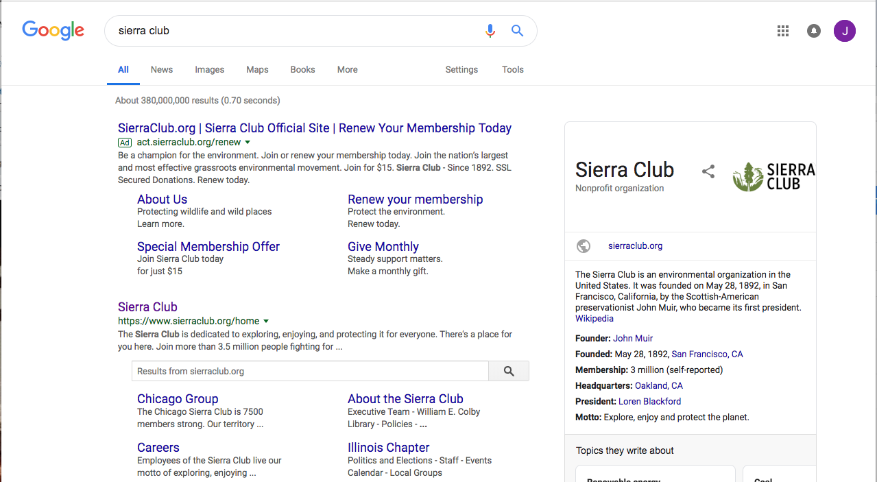
Low Hanging Fruit #7 – Fill out SEO Fields Properly
If you don’t have a few fields filled in properly, Google won’t read your website correctly. It won’t know quite what to do with you and it will be more challenging for people to find you.
If your website uses a standard CMS—WordPress, Drupal, Shopify, etc.—SEO fields should either be available out of the box on edit screens or available with a plugin (at Mightybytes, we use Yoast for WordPress). Do the following:
- Decide a core keyword/keyphrase for the page.
- Add that word into the page title.
- Add that word into the page headline.
- Write a meta description that includes that word (this is what Google shows in search results).
The SEO rabbit hole is deep. People dedicate entire careers to mastering the art of ranking higher in search engines. Addressing the basics, however, will make your site more readable by search engine robots now, regardless of whether you ever dive deeper into search optimization.
Low Hanging Fruit #8 – Complete Your Google my Business page (and Others)
Your website isn’t the only way to tell the internet who you are. For Google, be sure to claim your organization’s Google my Business page and fill out all of the available fields. This will let Google give you more real estate on search results and more robust listings throughout the Google ecosystem.
Similarly, most industries have review and ranking sites that allow organizations to claim a listing. Look at sites like Yelp and TripAdvisor. Search for and be aware of other review sites specific to your industry. For example, we’re a marketing agency so we’re on Clutch.
Section Four: Navigation
Your website’s navigation more important to the success of your website than almost any other element. If your navigation is intuitive your users will feel like your site is easy to use. If your navigation is complicated and unclear, your users will get lost.
Low Hanging Fruit #9 – Clear Names
A visitor who is not familiar with your site should accurately understand what they will find on each page in your navigation before clicking. Look in your navigation for multiple menu items that a new visitor wouldn’t understand the distinction. Do you have both a “News” and “Blog”? And “About Us” and “Our Story”?
Visitors have similar problems when navigation items are too clever. Don’t name your blog “See Our Words!” Name it “Blog.” The more clever your navigation is to you the more confusing it will be for your visitors.
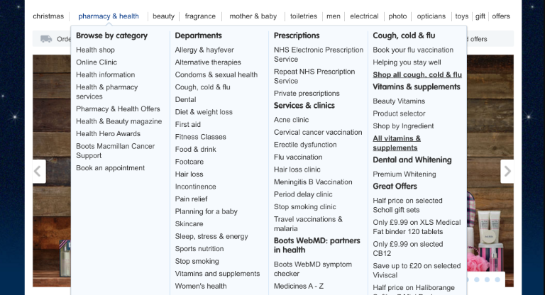
Low Hanging Fruit #10 – Simplify Navigation
When in doubt, get rid of drop down menus. They’re simply not very easy to use. When a visitor hovers over a navigation item only to reveal a massive drop down menu containing dozens of options she will feel stuck. It’s the navigation’s responsibility to make it quick and easy for a new user to find her way around.
Look through your navigation and remove anything that isn’t intuitive. Try combining similar pages when having them separate doesn’t add value. Move unimportant menu items to a secondary menu or the footer. When possible, add custom search functionality in case users can’t find what they need.
Make your primary navigation simple and intuitive. Reduce options whenever possible.
Section Five: Communication
Clear communication converts better. The harder your visitors have to work to understand what you’re trying to say and what you want them to do, the more likely they are to leave.
Updating the language on your website rarely requires help from your technical team but can lead to significant gains.
Low Hanging Fruit #11 – Kill Jargon and Use Inclusive Language
For jargon, have someone who is not familiar with your industry read your website and highlight any industry terms, including acronyms. For everything that’s highlighted, consider rewriting it using simpler language.
If it’s important to include an industry term, make sure to include enough information around it that someone who wasn’t clear about it would still understand what it means.
Similarly, use simple language that is easy to understand. This will help people with cognitive disabilities more easily understand your content. Also, get rid of language that might be considered offensive to some. Whole Whale’s Inclusivity Crawler can help with this.
Clear communication is almost always the fastest way to improve your website’s clarity. It is sometimes part of a full content audit.
Make Small, Smart Upgrades to Improve Conversion Rates
Which of these low hanging fruit can you apply today? Can you update your headline? Remove a cryptic acronym? Add a testimonial? You have the power to improve your website’s conversion rates and you probably don’t have to kick off a full website redesign to do it.
The opportunity here goes beyond the quick wins you can get by applying fixes like these. There are always simple upgrades you can make to improve your website performance—if you do them. Resolve to find something on your website today that you can improve. Make it something simple and small that could make a measurable difference. The time you invest will be worth the effort, we promise.