5 Alternatives to Using a Carousel on Your Website Homepage

The argument against using image carousels—those rotating content teasers that take center stage on so many homepages—is on the rise. In this post, we explore five image carousel alternatives you might want to use on your website.
From usability issues to massive increases in bandwidth, carousels come packaged with problems that aren’t thought out during the design process. And they’re not effective. Notre Dame director of web communications Eric Runyon measured carousel interaction rates on the Notre Dame homepage and found that only about one percent of all visitors clicked on the carousel. Of that one percent, over 89 percent clicked on the first slide. In a recent article on Search Engine Land, columnist Harrison Jones found that on B2B websites, carousels had even lower click rates.
Clearly, featuring a variety of content on your homepage is important. Your homepage needs to satisfy a range of stakeholder needs, all essential to your organization’s business and marketing goals (latest white papers, featured products, etc.). But we’ve come to rely on the carousel as the go-to design solution when it’s both bad for website performance and doesn’t meet the needs of your site visitors.
We’ve been redesigning our own homepage here at Mightybytes, and we’re using the opportunity to reconsider how to include a variety of content without using a carousel.
Here are a few options we’ve researched:
The Grid Approach
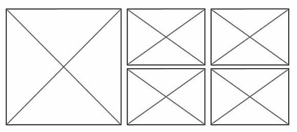
Why make your visitors sit through an entire animation if they’re looking for content at the end of your carousel? Calling out the content you would have in a carousel with smaller, static boxes gives the power back to the visitor, allowing them to scan the site more efficiently and find relevant content faster.
A grid should be considered a tool rather than a barrier, loose enough to bend to your needs so you can give more real estate to superior content.
Examples of websites using a grid approach:
Equivalent Buckets
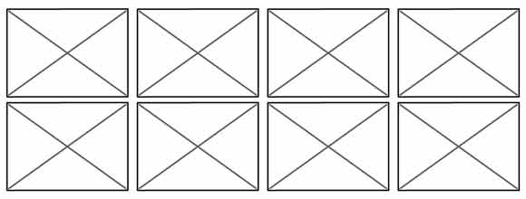
Similar to the grid, buckets are built by pulling out your carousel content and giving each piece its own space. The difference is that placing each content piece in a bucket divvies the space up equally. Now your visitor can decide what content is relevant to them, rather than have your preferences projected on them by image size.
Single, Primary Banner
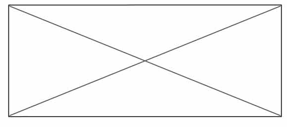
This option requires more curation and self control, but calling out your single most important message can help increase your visitor’s focus on that message. A lone hero banner could also be an opportunity to rethink and strengthen your strategy rather than adding ancillary content just because you can. A single banner doesn’t have to be static; simply adding another layer of interactivity can greatly increase engagement.
Targeted Homepage
Do you need to use distinctly different messaging for different audiences? Rather than dilute your homepage with content that’s irrelevant for a large portion of your visitors, or to better increase conversions, deliver a specific message based on visitor profiles. This approach uses a bit of code, which can be managed by a third party service, to allow you to change your homepage content based on things like visitor demographics, past behavior, and search keywords. Using A/B testing in your featured content can further validate this approach.
The Overflow Pattern
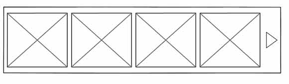
A close friend of responsive design, the overflow pattern gives equal real estate to each piece of featured content, but only displays what it can in the viewport. This is a great choice when you have a lot of similar content but don’t want to overwhelm your site visitors. This alternative resizes easily, but it’s important to use visual cues to hint that there’s more information to explore if the visitor wants to.
Examples of websites using the overflow pattern:
- The “Recommended Products” section on Amazon.com
- The “Popular Posts” section the homepage of Disney.com
If You Must Use a Carousel
If you absolutely must implement a carousel, there are some simple considerations you can make for an overall experience. First, switch from autoscroll to manual controls. Swapping your content while a visitor is viewing it throws in an unneeded distraction. Also, try to keep the number of slides to a minimum. The fresher your message is, the better chance you have to engage your visitor. Make sure every piece of content absolutely needs to be there before placing it in a carousel. If you can’t make a fool-proof case for it, pull it out.
UPDATE: We’ve written a follow-up to this post which contains more examples of web carousel alternatives.
Inclusive Experience Design
Learn more about how Mightybytes uses inclusive design strategies to help our clients strengthen stakeholder relationships while meeting their business goals.