More Alternatives to Using a Carousel on Your Website

We wrote a post over a year ago about alternatives to using a homepage carousel on your website. To date, it’s been the most popular post on the Mightybytes blog, and with good reason. In nearly every client kickoff meeting we have, the subject of a homepage carousel comes up. While by now, many of our clients know a carousel isn’t the best way to deal with the issue of homepage governance, it’s hard to think of design alternatives.
What is a Website Carousel?
A carousel refers to the section on a website homepage that contains rotating content. Sometimes the rotation is automatic (also why a carousel is sometimes called a “slider”), sometimes the user can control the scrolling content by clicking through to the next section. Homepage carousels offer a great visual way of displaying lots of different content on the home page of a website. The trouble is, no one clicks on them. Statistics say that fewer than 1% of website visitors click on carousels. In our experience, we see rates of about 2-5% on client websites that feature a carousel.
A homepage carousel is the web design equivalent of putting the couch in front of the TV. No one wants to do it, everyone knows it stymies conversation, and yet we all find ourselves without a creative alternative.
Our last post offered some wireframe options, but we thought we’d put together some design examples from real-life websites, along with some standard options to consider the next time you decide not to use a carousel.
Minimize Above the Fold Content
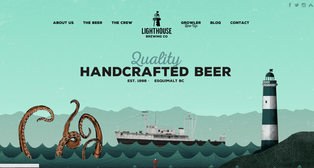
We know now that people scroll. So it’s not necessary to cram every last bit of content above the fold. Use that knowledge to tell a story that requires users to scroll down the page for more information, as with this example from Lighthouse Brewing Co. Note that this website also provides users the option to use the top navigation bar to move around the site.
Use a Background Image
You can use a header image, but it doesn’t have to be clickable. If you incorporate a larger image into the background, it gives you site context while allowing space for more information to be displayed in a small amount of above-the-fold space.
Commit to a Single Call to Action
You can create a powerful message if you can get everyone on your team to agree to a single call to action that will appear above the fold. The other benefit of a simple homepage like this, one without a main image and extra text, is that it’s sustainable.
Use Two Calls to Action
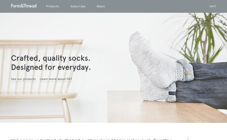
There are beautiful ways you can incorporate two important calls to action on a single homepage. This example from Form & Thread uses ghost buttons. Including two distinct calls to action can solve an important homepage governance issue without creating clutter or confusion. It’s still clear to the visitor where he or she will end up after clicking on either option.
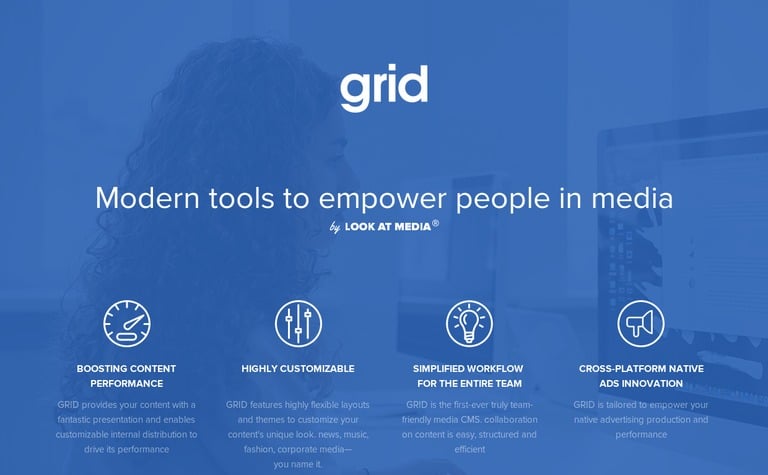
Use a Grid
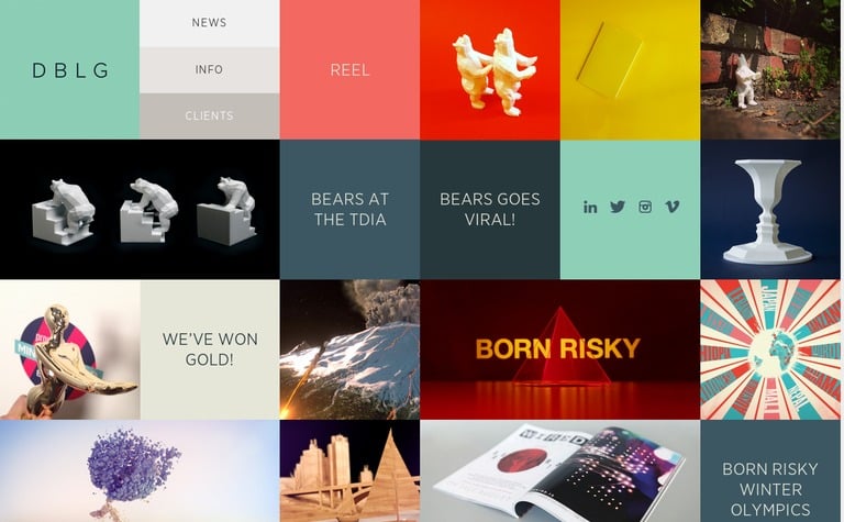
A grid is a tricky solution to the issue of homepage governance. Why is it tricky? Because they can be done well, as is the case here with DBLG, or they can be done terribly, essentially turning your homepage into a confusing version of Pinterest with no content hierarchy. If you’re interested in using a grid for your homepage, be sure that main navigation and important calls to action remain clear.
If You’re Going to Use a Carousel, Do it Right
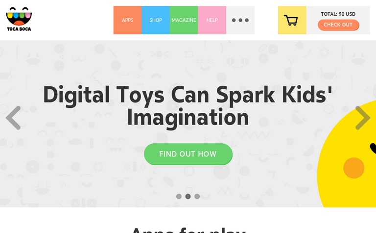
In some cases there’s just no way around using a carousel. But if you must use one, try a full-width one with a clear call to action in each box. It helps if each carousel slide is designed to fit in with the website’s overall design, as is the case here with Toca Boca.
Inclusive Experience Design
Learn more about how Mightybytes uses inclusive design strategies to help our clients strengthen stakeholder relationships while meeting their business goals.