Five Steps to Creating Better Calls-to-Action
A good Call-to-Action (CTA) is a powerful way to turn website leads into potential customers. In this post, we discuss five ways to craft winning CTAs and improve your website’s conversion rates.

What is a Call-to-Action (CTA)?
A CTA is a piece of content created to entice or inspire someone to perform a specific action. Calls-to-Action come in many shapes and sizes from donate buttons to newsletter sign-ups. The major unifying factor is that they communicate a directive.
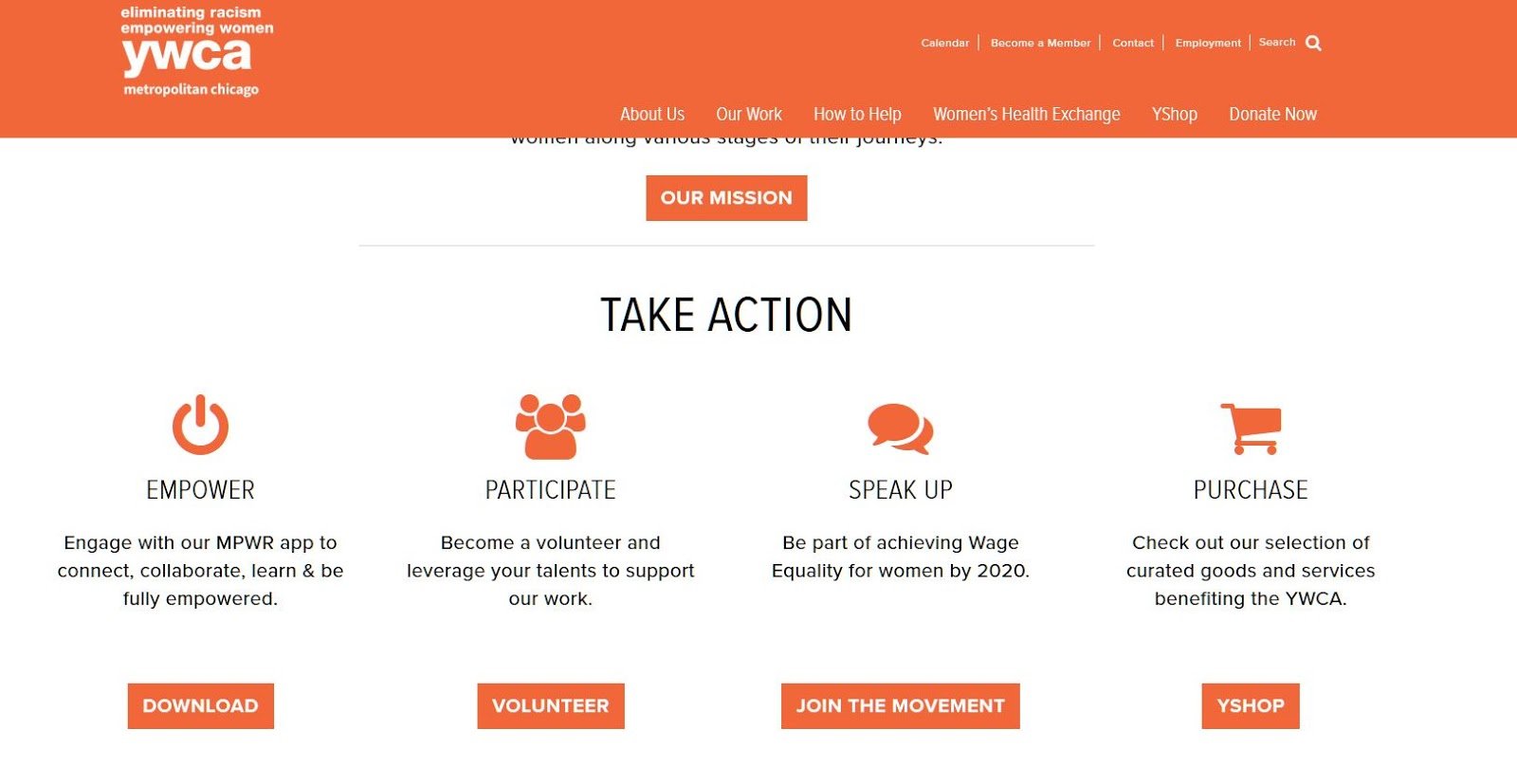
Take this example from the YWCA of Metropolitan Chicago’s website. Four similarly structured buttons offer users options to take action. No button is larger than the other. Icons and brief descriptions help users better understand what will happen if one is clicked.
But not all CTAs are this clear. Some offer little to no guidance for what will happen if a user takes action, like the dreaded click here. Others use copy that over explains what will happen, potentially insulting a user’s intelligence. Some are too big, some too small or otherwise not visible enough. How do you strike a good balance between all the various options at your disposal when crafting your website’s Calls-to-Action? Here are a few things to try.
1. Make Your CTA Pop With Color
Color matters. Certain colors are known to elicit specific emotional responses from viewers. This can be helpful when thinking about how users will interact with your content.
But there’s a major difference when it comes to CTA colors vs. the rest of your website. For your overall site theme, it’s smart to use high-contrast yet complementary colors. This improves readability and can be helpful for users with disabilities. A good CTA, however, should stand out. You want your reader’s eye to be drawn toward the CTA.
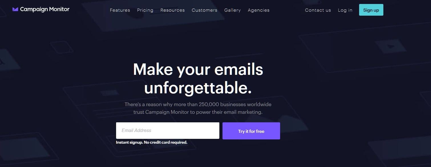
You can achieve this by using a color that pops against the rest of the page. Campaign Monitor has a great example of this. Their site uses predominantly dark purples, blues, and white. Page CTAs, on the other hand, use bright, complementary colors that stand out.
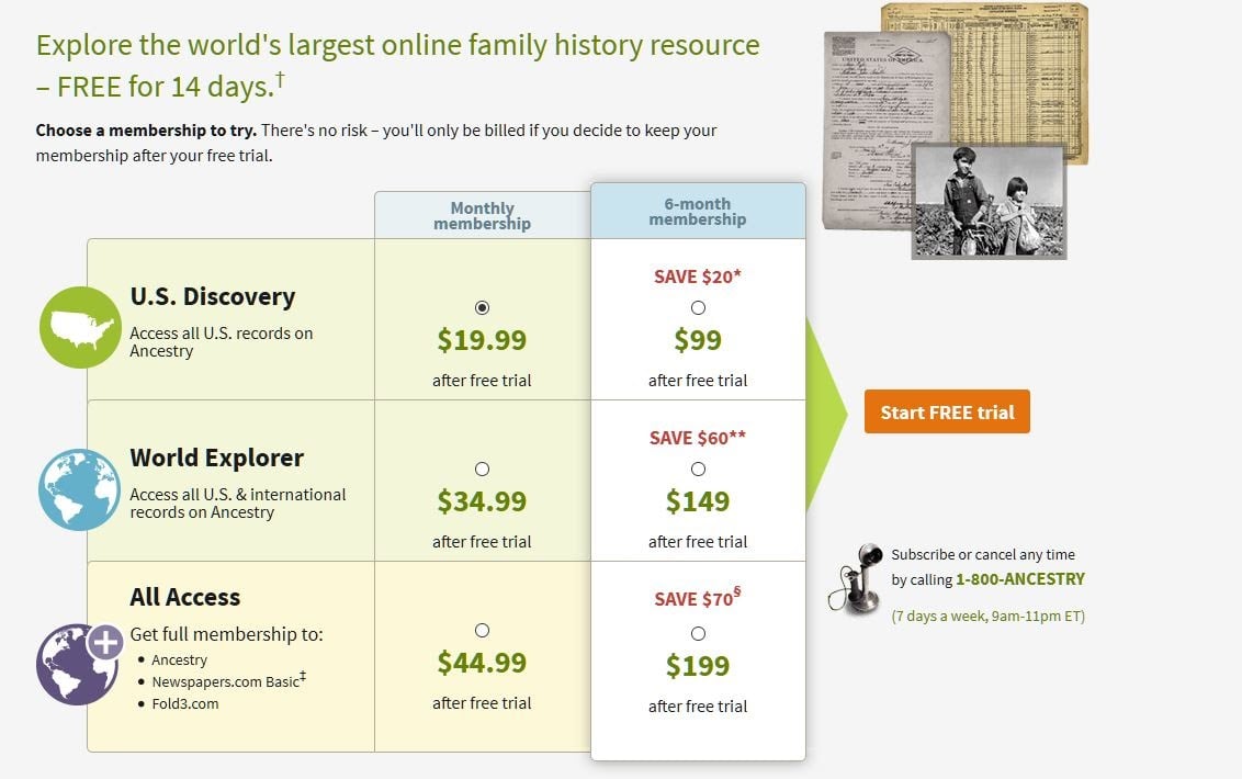
Other websites use contrasting colors like Ancestry.com with their orange CTA on a predominantly white and green website. In this example, the CTA also has plenty of negative space surrounding it, allowing it to further stand out in a relatively busy page layout.
Some experts believe that contrast colors are ideal for driving conversions, but the science behind that statement isn’t steadfast. We know for sure that good CTAs should visually stand out from the rest of a page’s content. Using color is a great way to do this.
2. Put it Where People Will See it
Put your CTA where it will be seen. Makes sense, right? Where, specifically, that should be may differ from page-to-page, however. Some websites put important CTAs in the navigation bar so that no matter what page the viewer is on, they can always access that CTA. Others include them as part of a page’s hero banner. There are many options. Which one is the best for your page? Let’s find out.
Reading Gravity and the Gutenberg Rule
In Western cultures, we typically start reading at the top left of a page and end at the bottom right. If we’re interested in the page’s content, our eyes follow a “Z” pattern down the page, ending at what is known as the “terminal area”, the last thing we see. This user behavior is commonly referred to as reading gravity or the Gutenberg Rule. (Not to be confused with Gutenberg, the new block-based editor in WordPress.)
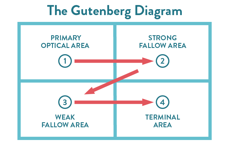
Given this, common sense might dictate that you put a CTA in the Terminal Area at bottom right since a user should be naturally inclined to move on to something new. However, usability studies have shown that if a user is only semi-interested in a page’s content they will scan the upper part of a content area in two horizontal movements then skim down the left side of the page (sometimes called an F-Pattern).
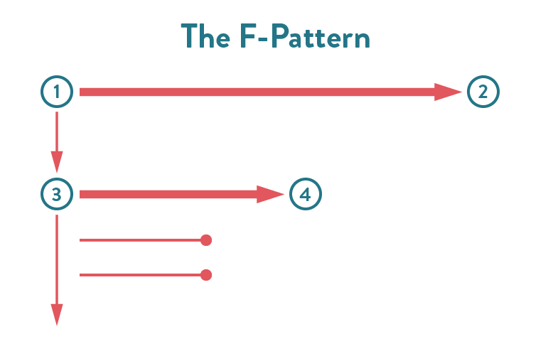
Content-heavy pages like blogs and news sites utilize page layouts that take advantage of the F-Pattern. Understanding this, you might consider putting a primary CTA in a sidebar along the upper right side of a page to maximize engagement opportunities.
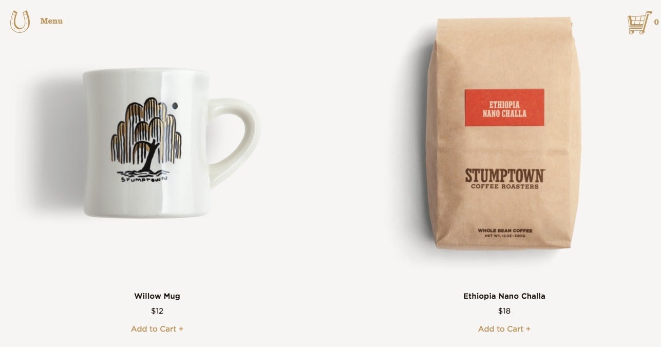
In this example, the company includes calls-to-action directly underneath product images, which makes sense. The CTAs, however, are tiny and the color blends into a white background. This could be difficult for users with visual impairments to read or those with physical disabilities to click on. CTAs should be large enough to read and obvious enough that any visitor can easily click on them.
3. Use the Right Language
Let’s say you’re doing some research on car pricing. You find a website for a used car lot in your area and they pitch you on realtime cost comparisons if you click a button below the offer. What should that button say?
- Buy Now
- Learn More
- Start Comparing Prices Today
- Any of the above, it doesn’t matter
“Buy Now” is a common CTA because it’s quick, to the point, and if your customer is committed, lets them know exactly how to pursue their interest. To be effective, however, the user must be compelled enough to buy your product. In this situation, you’re just browsing. You’re still contemplating choices.
So what about “Learn More”? If you offer a comparison service, this might imply there is further research to be done rather than a list of multiple pricing options. This could be misleading.
What about “Start Comparing Prices Today”? This wording has urgency and detail. It clearly communicates that clicking the button will lead to the service you want. This would likely yield the best results, including for people with disabilities who use assistive technologies to read page content aloud.
If you chose option 4, CTA language does matter. And it’s a thing that can be tested and proven. Make sure the choices you give users are clear and compelling. Also, while we’re talking here about CTAs, which are usually buttons, this also applies to any link text. Be descriptive.
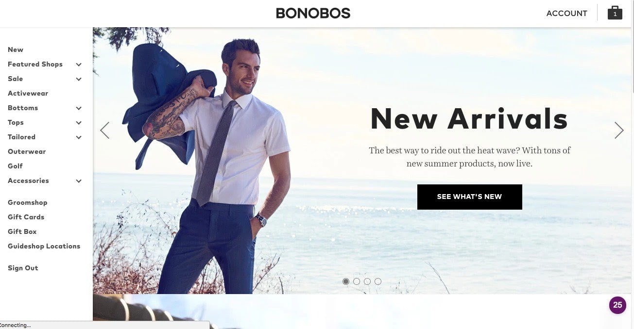
The Bonobos landing page for new arrivals offers another good example of this. “See What’s New” gives users a clear understanding of what’s beyond the click.
4. Understand User Intent
In the last example, “Buy Now” was too up front for your level of commitment. You were just comparison shopping. When crafting the right call-to-action, it is critical that you consider your users’ intentions with every click. In other words, if you’re on a product page, “Buy Now” might be appropriate. If you’re advertising a complex service, a user might not be ready to commit to a purchase, but they may want to “Learn More”.
User research and testing can go a long way toward helping you better understand user intent. With exercises like customer journey mapping, user personas, and user interviews, you can get a clearer idea of what users want from your site and how they prefer to receive it. This can help you craft more impactful CTAs that yield better results.
5. Test and Experiment
The fastest way to ensure you know what works best is to run some A/B tests. This will help you figure out which call-to-action placement yields the best results. Unfortunately, there are no consistent rules about what constitutes the best CTA across all websites. What works for one site might not work for another. However, there are plenty of testing methods you can employ to better understand what works and what doesn’t for your particular scenario.
In 2017, A/B and conversion testing platform VWO noted that CTAs were the most popular A/B test to run on their platform, comprising nearly 30% of all testing. In one of their case studies, they showed that Flos, a manufacturer of lighting solutions, was able to increase their conversions by 125% after experimenting with landing page CTAs. There’s always room for improvement.
We have seen similar results by testing content and CTAs on our own websites and those of our clients. While the four recommendations above are all grounded in common web design practices, you won’t know if you’re generating optimal results until you test them with real users. Be sure to allow ample time and resources for rigorous testing on your website. The results will be well worth the effort.