Web Accessibility Webinar: 30 Things to Know
Mightybytes recently hosted a webinar about web accessibility where we shared 30 different tips you can use to make your website more accessible for people with disabilities.
The video and transcript of that webinar are below. The slide deck for the webinar is at the bottom of this page.
Webinar Transcript
Tim: Today we will talk about making digital content accessible. We’re going to cover a bunch of tips and tricks that you all can hopefully apply to your own work. We will talk about a project we did where making digital content accessible played a key role and hopefully at the end will have some time for questions.
Tim: For those that may not know, we are Mightybytes. We are a digital agency located in Chicago. We have been around since 1998 and we’ve been building websites for people for almost that long. We are also a Certified B Corp, which means we meet the highest verified standards of social and environmental performance, transparency, and accountability. That basically means we use the power of business to build an inclusive and more sustainable economy. Mightybytes is a proud member of the B Local community in Illinois and is happy to be a B Corp. We were B Corp number 9 in Illinois. The team that is going to be presenting for you is myself, I’m Tim Frick, the CEO and founder of Mightybytes. Veronica, do you want to introduce yourself?
Veronica: Hello, I’m Veronica Bagnole. I’m a product manager at Mightybytes and have managed several of the projects that we work on that deal with accessibility.
Tim: Steve.
Steve: Hey, I’m Steve. I’m a web developer here at Mightybytes and I was the lead developer for the Access Living website project that we will be discussing later as a case study. I’m here to answer any development-related questions that you might have.
Tim: Awesome. Thank you. During this presentation, we will cover some web accessibility basics, how to create more accessible content, and walk you through a series of dos and don’ts for making the web accessible.
Tim: There are up to 1 billion people around the world with disabilities. That’s up to 20% of Americans. A vast range of disabilities can impact how people use the internet. Disabilities come in many forms, this includes not only physical and cognitive disabilities but also temporary disabilities like breaking a limb, age-related disabilities, like needing reading glasses for instance. Sometimes things we consider to be minor or temporary disabilities can make it difficult to browse the web—hearing loss, blindness, color-blindness, dyslexia, tremors in hands, lost limbs, broken arms. All of these things can make it challenging for people to use the internet. That’s what we are going to talk about today.
Tim: Many folks use assistive technology to access content. This could be a wide variety of devices, including screen readers, magnification software, text readers, speech input devices, head pointers, motion and eye tracking, et cetera. So, with all of that in mind, how do you give all of your users the best experience possible regardless of limitations or disabilities considering a wide array of devices there are out there?
Web Content Accessibility Guidelines (WCAG)
Tim: So, the goal is to give the best experience. Today we’re going to talk about how we do that. We’re going to use the Web Content Accessibility Guidelines, also known as WCAG, and they are considered the guidelines for worldwide web accessibility. It is what we use. They are not necessarily a standard but they are a set of guidelines that you can use to build your own sustainable content – or accessible content, also sustainable.
Tim: Version 2.1 is the latest version of the WCAG. They are a formal set of guidelines for websites and digital products. They are written by the World Wide Web Consortium as part of their Web Accessibility Initiative. They are considered the gold standard and referenced around the world for laws related to web accessibility. Mightybytes, by the way, is based in the U.S so that’s our frame of reference when we talk about laws related to web accessibility. WCAG, the web content accessibility guidelines, come in three flavors: A, AA and AAA. Those are the three levels of accessibility so I’m going to quickly go through those and what they mean.
Tim: A is the easiest level to achieve. Basically it makes a website or a digital product easier for assistive technology to navigate through a site and translate it. It improves accessibility for most sites but it’s also pretty basic. AA is accessible to people with a wider range of disabilities. That includes guidance on color contrast and error identification. Typically, when the Department of Justice or the W3C encourage accessible websites, they’re talking a lot about AA. That’s probably the most common flavor of accessible website. AAA is the highest level of accessibility for the widest range of people. Something to keep in mind, it could alter visual design and how you interact with it. As with others, any of this is an ongoing commitment to maintain these guidelines. So, it is something really important. You don’t just build a website and throw it out and say “it’s accessible” because ultimately your website is a tool to grow your organization. You will be constantly adding content to that and that content has to maintain these guidelines just as the website itself does. I’m going to hand it over to Veronica for the next section of our presentation.
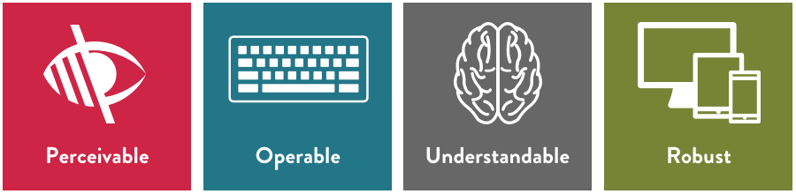
Veronica: Thanks, Tim. Now that we have a sense of the different levels of web accessibility, the question becomes “how do you actually improve that on your website?” If you are trying to implement things, you need some guidance. That’s what we will be talking about for the majority of the presentation. The good news is the web accessibility guidelines that we talked about are literally that, they are guidelines that you can look at and there’s a bunch of different points, almost like a checklist, that you can complete and move on to the next thing. So, it is a really useful thing to have access to and they are published on the website for the WCAG guidelines. In summary, the guidelines are broken into four principles or four categories. Those categories are perceivable, operable, understandable, and robust. We will dig a little deeper into each of those as we go through. The nice thing about this is that they have each got their own set of guidelines within these categories, and you will find that sometimes they overlap. For example, you may see the same guideline under perceivable and understandable and it means it fit both of those categories. Once you achieved that level of accessibility you can mark it off of both categories. The other nice thing about this list is it does have a number associated with each item, which means if you want to speak to a colleague about it or ask a developer to fulfill a certain task, there’s an actual number you can reference so that you all know what you are talking about. And it’s no surprise that these guidelines follow what is really considered best practices in the industry for web design and web development anyway. That’s because at the heart of this, these guidelines are trying to make your websites more usable for your users. It just so happens that the definition of “usability” is broadened because we are focusing on people with disabilities and the issues they may face while they are navigating the internet.
Perceivable Content Guidelines
Veronica: So, let’s dig in a little bit to perceivable. By definition, “perceivable” means that your information and user interface components need to be presentable to users in ways they can perceive. That’s really key, it’s not saying ways they can see or view but rather perceive. That’s because a lot of users will not be able to physically see your website. They may be using screen readers to read the content because they could be blind or have low vision, or even someone who is color-blind may find it difficult to see certain things on a website. By saying “perceive” we are making it more inclusive to everybody.
Veronica: One of the things you can do to make your content more perceivable is to have a strong color contrast on your content. Nobody wants to go on a site and have to squint because the text is sort of glowing or radiating off the background. This specific issue is something that you can fix quite quickly and makes a really big difference to users. So, when we talk about color contrast, at that AA level that Tim said is the most common level to try to stick to, we want a ratio of 4.5 to 1 color contrast between the paragraph text and the background. If you’re like me, you probably have no idea what that means in real terms because that ratio doesn’t make sense. And that is totally fine. There are a lot of tools out there, and we will share one later on, that will let you put in the colors for your text and background and you will be able to see if the contrast hits the mark. If you are using larger text then the color contrast requirement goes down. That’s because if your text is larger it should be easier to read just because of its size. The contrast is then 3:1. The one thing that a lot of people don’t realize when they are talking about color contrast for accessibility, is that the link color needs to have a color contrast against the text around it. I’m sure you probably have been to a website where you can’t actually spot the links because the color between the link and the regular paragraph text is just too close. So, the requirement for AA is that your link color be a 3:1 contrast to the rest of your text on your paragraph there.
Veronica: Another thing that you’ll want to do is to avoid putting text over an image. This is because it can get very difficult to read. The example we have on the top here is a beautiful image. I’m sure it would do the website proud to have such a great image on there, but the actual text on it is very difficult to read. So, if you are going to put text over an image, try to include some sort of dark overlay so that people get that color contrast through the overlay. Another thing you want to avoid is to have text in the image. I know it’s quite difficult, if you are not a developer, to put text on a page. Maybe you want some fancy layout and you want the text on top of the image. So, you think the easiest thing to do is pop it in the image and save it as a JPEG. The only problem with that is screen readers cannot read that text. If you are going to have text in your images it needs to be completely decorative. It shouldn’t have any content that it is trying to put forward. There’s an exception for logos. They are considered decorative in this case. You don’t need to worry if your logo has writing or text within it.
Veronica: Another way that you can get images to be more accessible is to include alt text and captions for them. Alt text is a type of text that screen readers and other assistive technology will use and they’ll read out loud what the image is supposed to be. So, if you are able to describe the image in your alt text in as much detail as you can, that means that someone who can’t see the image can understand what the image is presenting. So, it’s really important to include that alt text and make it descriptive. Do not use the file name for your alt text. It doesn’t mean anything to anyone. So, try to avoid that. Also, try to stay away from including symbols or emojis within your alt text because assistive technology can’t read those. The benefit to this, in addition to helping people with disabilities, is that search engines also look at the alt text when they are looking for images to present in image search results. So, you will be helping your SEO as well as your users if you get your alt text right. Put in captions to help people get more context around the image. That is not just for people living with disabilities, that’s for everyone.
Veronica: When it comes to captions, you should also include them in your videos. That’s because someone who’s hard of hearing won’t necessarily be able to hear the video, but they should still be able to consume that content. By having captions within your video, you’ll allow more people to engage with the video itself. It is also beneficial for users because if someone is in a workplace, or library, or public area, they can read the captions instead of turning on the volume, which will just help usability overall.
Veronica: Another thing you will want to do for videos and also for audio files is to try to include a transcript within the page that the video or audio file exists. That’s because some people won’t be able to use multimedia with their assistive technology and by giving them a transcript they will be able to understand what that piece of multimedia was actually presenting. If, for some reason, you can’t provide a transcript, for example, you don’t have the resources or the video is over an hour long and you just don’t have the ability to provide that, please try to include some sort of summary about what the video is about and any key information that the video or audio file presents. That way the person who does need the transcript can at least get the sense of what information is being imparted on that video.
Veronica: Another issue, which may seem logical to you, but is quite often ignored is the idea that your content should be displayed in sequential order. That’s regardless of whether someone is looking at it on a desktop or a mobile device or some sort of assistive technology. This is just good UX but it is very important to people that use certain assistive technology because they tend to use the tab function to move through a web page. If, as they are tabbing, the content is not in sequential order, it will get very confusing, particularly if they can’t see your design which may help to explain the order of things. If someone can’t see that and the tab is all they rely on, your content needs to be sequential or it will get very confusing and they won’t really understand what you are trying to say.
Operable Content Guidelines
Tim: Okay. Now we will talk about what operable means. Essentially that means the user interface components and navigation should be operable with a variety of tools.
Tim: So, for instance, all content should be keyboard accessible. So, if you are building a website, you want to design it in such a way that all functionality can be used without a mouse. The keyboard tab key, as Veronica mentioned earlier, is a very common way of being able to navigate through web content but also people might use speech direction. In general, it’s good to avoid dynamic content that requires a lot of mouse movement or if you have to do that provide alternative methods to access that content. Whenever possible enabling keyboard shortcuts is helpful and in general it is good to make all functionality easily available from the keyboard.
Tim: We want it to be device accessible, as well. We talked about making something easily accessible from the keyboard. Folks on iPads and tablets and phones and stuff like that, they should be able to carry out the same tasks, regardless of whether or not they are using an iPad, or their laptop or whatever.
Tim: Also, make sure that when you are creating operable content you give users enough time to read and digest it. If you have time-out windows or quickly-moving banners, those are things to avoid. Allow users to easily return to content. So, if they need more time to view it or re-read it again or stop the motion all together, that’s a helpful way to do it.
Tim: Also, don’t create content that flashes more than three times a second. Don’t design anything in a way that is known to cause seizures. Flashing text is really bad, especially for people with epileptic conditions and stuff like that.
Tim: Make the content navigable and clear to understand. Button action text should be clear, easy to understand and users should know exactly which action they should take without having to read any instructional text. The buttons should act predictably and they should be clear when you are trying to use them.
Tim: Also, under navigable, provide ways to help the user navigate and find content. Include descriptive titles, headings, sign posts, and clear calls to action. Basically, chances are if you are questioning whether or not a call to action, a caption or button is clear, there’s a good chance that it could use some improvement. Then make sure to allow users to bypass blocks of content on multiple pages.
Tim: Also, structuring. Veronica talked a little about this. Structuring your content using HTML5, making sure it is sequentially ordered. Using heading tags to structure your page is really important when it comes to creating accessible content. Sometimes inexperienced content creators and content managers can decide to bold a header, for instance, when a screen reader will look at that and they won’t see it as a header and likely if they are using a tab key will skip over that. Make sure you use appropriate heading and title tags using HTML5 is really important. Content structure matters. In other words, don’t rely on text size or placement to determine the structure. Make sure you’re using appropriate HTML5 structure.
Tim: Websites with a lot of content can easily confuse users, so navigational hints like breadcrumb trails, as shown in this screen grab from Best Buy, they can really help users understand where they are at. Breadcrumb trails, sub-navigation, underlines in the main navigation, basically any navigational component that can help users clearly understand where they are in relation to where they want to go is super helpful. Back to Veronica.
Understandable Content Guidelines
Veronica: So, the next principle is understandable. When we talk about understandable, we mean that websites should be clear and they should have concise and understandable language and that they offer functionality that is easy to comprehend and easy to predict. That’s just good practice in general, which is great. But this is particularly important for people who may have cognitive disabilities or maybe they have physical disabilities where movement of a mouse is quite difficult and therefore, if they have to undo something, that is actually problematic for them. So, the more we can reduce confusion on a website the better experience we will give people.
Veronica: One of the first things you can do is to focus on the text that you have on your website. This should be readable and understandable. It should be written in plain english and really avoid the use of jargon or figures of speech or abbreviations. I know that in some industries it’s unavoidable, but try to keep that to a minimum. It’s recommended to keep your reading level to a maximum of 8th grade so that we are simplifying the language and making it understandable for everyone.
Veronica: Another thing you can do is to use what’s considered normal font for your body content and your headings. I know there are a lot of beautiful fonts out there that are created more for design aesthetic than to be read, but it can cause difficulty really for everyone who visits a website. For the bulk of the content, try to use a nice, clean font that can match your branding but that easy to read. You want to avoid large amounts of text that have underlines or italics, and also avoid writing in all caps because that does make it more difficult to read your content. That being said, a little bit of content with some sort of underline or italics is fine, but what you don’t want is paragraphs upon paragraphs of these styled texts.
Veronica: Another thing you’ll want to do is to keep your layouts and functionality consistent throughout your website. For example, if you have a navigation on the left-hand side of your website, and for all pages that exists there except for a random page that you decided you wanted to put the navigation on the right-hand side, that starts to get confusing for people. Make sure that all of these structures of your site, whether it’s the header, the footer or navigation, remains consistent so people know where to look for things. Another thing you’ll want to do is to left-align the majority of your text. I realize that in some cases, for example, a hero banner, there may be some center aligning of text, but if possible, shift that over to the left because that’s how people are used to reading – from left to right – so just make it easier on people to be able to read that content. Finally, what you’ll want to make sure you do – I think we touched on this earlier – is to make sure the functionality on your page exists across your site in the same way. For example, if you have a button that works a particular way on one page, make sure that it works the same way on the other pages where it exists. That will help make things more predictable for people. It will also help to make everything more consistent across your site so there are fewer surprises for everyone who uses that functionality.
Veronica: For those of you who have actions that users need to take that span multiple pages – for example, if you have an e-commerce site and you have a shopping cart process that has a few pages for users to go through – you’ll want to make sure that on every page those users have instructions or some sort of reference for anything that they need to fill in on that page. So, do not make people remember instructions from a previous page. It’s difficult and also, it’s unnecessary. You can have all of those instructions and hint text on the page so they don’t have to rely on the back button or to lose their place. Going to that shopping cart example, you may want to display the items being purchased on every page of the process so the person can reference it at all times, just to put their minds at ease and to allow them to continue through that experience.
Veronica: Another thing you can do when it comes to forms is to let people know how they should avoid mistakes and also how to correct mistakes if they do end up making them. For example, you may have seen on other websites when you go to a form, there may be an example of what that field requires. Most commonly, you’ll see this for numbers. So, phone numbers, do you have a dash in there? Do you not? Or dates, what order are you doing – day, month, year, or month, day, year? Are you including the four digits of the year or two digits? All of that example text helps you figure out what the website is asking you to provide. Now, if a user makes a mistake, you want to make sure the instructional error message that you give them helps them understand how to correct that mistake. In an example here with the email, the user has not put in a complete email. The error message says “please enter that valid email address.” What we don’t want to see on there is something like “error in field” or something really vague that does not help anyone to correct the issue that they have made. Clearly, this person thought that was enough to put into the field. So, you want to make sure that you help to guide them through to completing the field in a way that it can be submitted.
Veronica: Another thing with websites is you are bound to have clickable areas, whether that’s on a button or your navigation or some sort of panel that links to another page. What you want to make sure is that these areas have a wide enough, or large enough clickable area so that someone doesn’t have to be pixel perfect in where they are clicking. I want you to imagine, for example, somebody who has tremors in their hand. As they move the mouse, their cursor is shaking on the screen. It would be very difficult for that person to click a very small point on your website. So, give them a little bit more breathing room. Make that clickable area a little larger so that somebody who is having some difficulty with precision can still take an action on that click.
Veronica: Finally, if you’ve got a form that requires a lot of input and there’s a way you can help your users, then go ahead and do that. For example, if you have a form where someone needs to put in their ZIP code, if there is a way for you to automatically populate the city and state, based on that ZIP code, that’s going to help people a lot. Or if they can’t be done, maybe provide them with a look up ZIP code button. Instead of having to go off of your site to somewhere that may not be accessible, they can actually look the ZIP code up on your site and get the ZIP code into the field. That’s just a few examples of how you can help people fill in a form through shortcuts.
Robust Content Guidelines
Tim: Okay. This last section is on robust, which is defined as website’s working well across platforms, browsers and devices so they account for personal choices and user needs. This is a pretty simple section. It is literally only one screen, one slide here. Just make sure you are following the best practices for development, programming, maximizing compatibility of assistive technologies. In general, cleaner code will work across a wider array of devices and platforms and it will also be more accessible to search engines and more accessible to all kinds of users, not just people with disabilities.
Tim: So, that’s the four sections that we are talking about here for the web content accessibility guidelines. Why should you care? There are a few important reasons. I think we have covered some in our previous slides.
Tim: One, it is simply the right thing to do. You could be alienating as many as 1 billion users around the world if you are not doing it. It helps people who don’t have access to content to access that content and it’s just the right thing to do.
Tim: It offers better experiences. When you do that for people, they are more likely to be repeat visitors. So, giving a better experience makes them more likely potential customers.
Tim: And finally, the last one is lawsuits. There have been an increasing number of lawsuits over the last few years on accessible websites. The most high-profile recent one is the Domino’s case that the Supreme Court last week refused to hear. The Supreme Court didn’t actually make a judgment on that, which I personally think they should have. It does send a message that the Americans with Disabilities Act does apply to websites and this is an important thing to keep in mind when you are building your own websites and creating your own content. There are — if you are a government agency or what is considered a public-facing entity, it is the law that you should have — it’s not necessarily the law just yet in terms of there is no clear law on the books saying that this has to be this. The Supreme Court case last week was to decide whether or not the ADA includes websites. However, public-facing entities and government agencies are required to create accessible websites and create accessible content. Just a word to note that you could be opening yourself up to a potential lawsuit if you are not creating content or keeping these things in mind when you build websites and digital products.
A Web Accessibility Case Study
Tim: So, finally, for the last section of the webinar, we are going to go through a case study of work that we did with a group called Access Living in Chicago, which is a disability rights advocacy group. Veronica will take us through that.
Veronica: Thanks, Tim. Access Living came to us because they, like any organization, wanted a website that would fulfill typical business goals. They want to increase their visibility online, they wanted to promote their services and increase donations, but they also wanted something more than that. They wanted us to build a AAA website that would be an example site of what a well-designed, well-built website could look like and could function like at the highest standards of web accessibility. They also asked us to build it in the WordPress CMS, using the latest editor which is known as “Gutenberg,” so their team could update content regularly. The driver behind this was that because they are an advocacy group for people living with disabilities, they wanted to make sure that all of the visitors to the site, including the people they champion, could access their content and experience their website in an easy way.
Veronica: This was quite a big challenge for us. We knew there would be some complications, but we also knew there would be an opportunity for the industry in looking at this website to learn from the experience.
Veronica: As we began the process, we kept accessibility in mind at every stage. So that included design, development and what’s known as “QA” or testing the website across different browsers and devices. Throughout our conversations at each of these stages, we would discuss whether or not what we were doing was hitting AAA accessibility. If you remember, that’s the highest level of accessibility out there. So, in order to do this, we ran a lot of accessibility reports through a tool called Siteimprove at multiple stages of our development process. That allowed us to catch any development issues early on so we could fix them and reduce the knock-on effect that any accessibility problems might give. We also used SiteImprove’s free Chrome extension to check pages as we were updating them to make sure everything we did was conforming to these guidelines.
Veronica: Throughout that process, we were building a site, we were creating designs and everything was going well. We were happy with it, but we wanted to make sure that actual users, who use assistive technology or who have some disability could experience the website as we thought they could. That’s key because if you don’t have a disability yourself, you do have a level of assumptions as to what will and won’t work, even if you are checking off a box that says, yes, I completed that guideline. So, what we did is we assisted Access Living with coming up with ways that they could test the website with users who actually have disabilities and who also use different types of assistive technology. The feedback we got from them was woven into updates to the website to make sure that we could get the site as accessible as possible to those users. That feedback was really crucial to getting the website in the state that it is now.
Veronica: We learned a lot in this project. The first thing we learned is that this is an ongoing process. We have these guidelines, and you can certainly tick the box to say you have completed them, but it is an ongoing process and I would urge you to think of it similar to your general marketing campaigns, which are ongoing, or your search engine optimization campaigns, which are ongoing. This has to be along those lines. You have to keep coming back, keep improving and constantly see if there are ways to update your site to make it more accessible.
Veronica: We were talking to one of our contacts at Access Living and she made a really important point. She said the accessibility guidelines should be considered the floor, not the ceiling. There are always ways to improve what you are doing. Just because you met a guideline doesn’t mean that you can’t make it better.
Veronica: One of the ways this is ongoing is through content. This is really just as important as the design of the site or the development, because content is constantly being updated. Your team needs to begin to learn how content can be accessible. We touched on a few things, for example, adding alt text to your images or not including text within an image. We also talked about using HTML5 and the correct heading structures for your page. As you are going through and creating new content on your site or updating existing content, always have web accessibility in mind.
Veronica: The other thing we learned is that AAA websites don’t have to look boring, which is great news. Because before we did this site, most of the examples that we found, if not all of them, were very bland in design. They had a white background with some black text and no images. So, a AAA website does not have to be boring. You just have to know that you are going to focus on accessibility from the beginning and develop it with that in mind.
Veronica: Another key thing you want to take away from this is that you’ll never be able to get your website to work perfectly for 100% of your users. It doesn’t mean you are failing in web accessibility. In fact, the WCAG recognizes that this is impossible. There’s always going to be someone with outdated assistive technology or just a very unique disability that have not been accounted for in their guidelines. Do not think that if you fail to get it perfect for everyone that you have lost the game. In fact, what you are trying to do is make your website the best experience it can be for the most people. So that’s why this is a constant process. There’s always something you can tweak to get it more accessible for somebody else.
Veronica: Now WordPress was a challenge when it came to accessibility. The Gutenberg editor is not accessible and that is certainly something that WordPress is aware of, and that they are working on. The other issue we came across with WordPress is a lot of the plugins that exist do not take accessibility in mind. That may be because this is a relatively new thing for developers to start to learn about. We are hoping as plugins grow and as accessibility becomes more common conversation that these plugins will also become more accessible. But that was one of the areas that we found we had to do the most work on. In fact, the site at the moment where it does not meet AAA accessibility standards is because of a few of the plug-ins we are using. Again, back to the idea of this being an ongoing process.
Veronica: The last thing we learned that we wanted to share with you is that this is very much a team effort. You’ve got to get your designers, developers, content creators and your QA team all on board. It really does take a village to make a website accessible. We recommend that you have those conversations. If you need to train your team on web accessibility then please do so because each one of these members of the process will have a role to play in making the website accessible.
Tim: I’d just add to that in this particular case, we also really lucked out in having a very engaged and excited client to work with. They were very much a part of this process. In fact, the entire lifecycle of the project was a very collaborative effort. That made a big difference in the end result.
Veronica: We just have thrown a lot of information at you. Now you know the different levels of accessibility. We have given you a few tips, but where do you start? Because it is intimidating, there are hundreds of things you could do. So what happens next?
Web Accessibility Resources
Veronica: When we share this webinar, we have this slide with a few links to tools that you can use to really get your first steps into web accessibility. My recommendation is to go on to either SiteImprove or Wave, they are both accessibility tools with good reputations, and play around with it. They have free versions available. As I mentioned before, Siteimprove has a Chrome extension. Get that on your browser, play with it and see what comes up. You need to start to delve in slowly and familiarize yourself with how these tools work is a good starting point. Personally, I prefer SiteImprove. I think the usability is easier but Wave is also well-known. There are a lot of color checkers out there. We have a link for one. This is the tool that you can use to look at the color contrast that I talked about earlier. All you’ll have to do is put in your text color and your background color and it will tell you if it’s hitting that ratio of color contrast. The color contrast ratio changes from AA standards to AAA standards so it will tell you which one you are meeting and also if you are hitting accessibility standards for large text versus small texts. It is quite useful in that. We have also put together a web accessibility guide that is sort of a checklist. It doesn’t have everything, sort of like this webinar does not have everything. But it’s a good starting point and gives you some first steps that are pretty actionable with either a content team or if you have an in-house designer or developer, they may be able to use that as well. Finally, we do publish articles on web accessibility. So, if you subscribe to our newsletter you will be able to get that as soon as it is published.
Q & A
Tim: Yeah, to that end, we hope to have a video of this webinar and a transcript and these links on our website within the week. We also have a case study for the Access Living project that goes into a lot more detail than we have here. We will send a thank you to everybody who attended with those links in them. Veronica, there was a question during the webinar about the timeline for Access Living and how long of the timeline was dedicated to testing. Can you talk a little bit about that?
Veronica: That’s a great question. In terms of the process to create the website, I don’t think that it took longer than the normal website we do. Typically, about four to five months for a website of that size. So, the timeline was not impacted by accessibility, but that’s because we started the process thinking about it. So, we had our designers briefed to think about the color contrast and to think about navigation and all of those other things that go into accessibility in design. They were briefed so they included it in their designs and then we moved from there. When it came to the usability tests, actually testing it with people who have disabilities and different assistive technology, again this was not longer than the average user testing process we go through. We just had to think of it in a slightly different angle. So, our questions became more about how does your device engage with this particular thing? Can you perceive what’s on the page, et cetera? I will say we did run what’s known as a “SUS score” with these users. We did have to change the SUS score questions. Typically SUS score questions are a standard set of ten questions and you don’t really change the wording of them, but because we had some people in the test who had some cognitive disabilities we needed to make it more understandable. Also because a lot of these SUS score questions pertained to someone who does not have accessibility issues, someone who does not have a disability, we needed to rephrase those and talk about their assistive technology. Long story short, it did not change the amount of time but that’s because we considered it from the beginning.
Tim: Yeah. I would encourage — we have a couple of minutes left on the webinar. I would encourage anyone listening in, if you have questions we haven’t heard from Steve yet and Steve is here to provide us with how this went down from a developer’s angle. But if you have questions, please put them in the Q&A panel in Zoom here.
Tim: One attendee just asked if the client created an internal team to maintain the website or opt to engage you for support? The answer is both. They have a team of two at Access Living but they are also doing something interesting in that part of this process is an internal education process for them, so they are giving people within the organization ownership of specific content with the condition that they are trained up on these various components of accessibility so when they are managing their own section of the website and content that they are working on that it continues to maintain the level of accessibility. Anything you want to add on that, Veronica?
Veronica: Yeah. The other thing I’d add to that is we are considering a phase two where we will make the site even more accessible. So it is that idea of this being an ongoing process, both for the developers and the designers, but then also for the content creators.
Tim: Great. Lee has a question about “what back-end considerations are most important to understand at the beginning of a AAA website goal?” That sounds like a question for Steve if I ever heard one. Steve, do you want to give us some developer wisdom? What were the things you needed to consider or think about when going forward with a AAA website?
Steve: Sure. A lot of the considerations really start at the design phase. Making sure that spacing and sizing meets the required criteria and color contrast and those sorts of things. As far as the development side of it, we took a look at WordPress and how well that could reach our goals for AAA. WordPress allows a lot of customization but one thing that we mentioned was the admin side of WordPress, particularly in Gutenberg, doesn’t have AAA accessibility yet, which is something we discussed with the client and decided to go forward with knowing it would be just their internal team using that. So, you definitely need to look at the platform you are going to use. Make sure that it has the flexibility necessary to support AAA. If you are going with a theme, for instance, like a pre-made theme, there are very few of them out there that are actually AAA. There’s a handfull of them that claim they are but they typically fail the tests when you actually test them out in SiteImprove or Wave. So, the consideration it is an open-ended question but I feel like the main thing is making sure that everyone, you know, from the developer, designer and content is sort of on the same page. All working towards that goal of AAA. If the developer is given a design that is already conforming, it makes their job a lot easier. Then they are just working on a lot of the HTML5 stuff, like using the semantic HTML5 tags, asides, and sections, adding aria labels and that sort of thing.
Tim: Great. That’s awesome. I’ve got two more questions and only a few minutes. As a follow up to that, Lee is asking how do you identify WordPress plugins that are AAA friendly or not. How was the vetting process for adding plugins for the Access Living site, for instance?
Steve: It is pretty much trial and error. Put them in and test out the page. Run it through SiteImprove, Wave, whatever you can and kick the tires. Very few are, and once you see they aren’t, see what you can do to improve it and work towards that end. A lot of plugins give you the ability to make adjustments and make them more accessible. But that’s definitely one of the more challenging aspects of this project, and probably most AAA projects.
Tim: One last question. When linking to PDF documents on your site, is there a recommendation on making those more accessible? Veronica, do you recall if there was a PDF conversation that happened during the Access Living project? I know there’s been a lot of back-and-forth discussion internally about PDFs and stuff like that. Did you have any specific discussions during the Access Living project?
Veronica: Not necessarily during that project. But in general, PDFs are not as easily read by certain assistive technology as an HTML page. Actually, one of the recommendations by the WCAG guidelines is that you should have your content on an HTML page even if it is also in a PDF. I know in some cases that is not possible, because you want that PDF to be a download that people have to give you their contact details before they download it. If you are going to have a PDF download, if you could have a summary about it before the person downloads it, I think that would be helpful. Also, make sure the file name is clear because we did run across that with Access Living. If it didn’t have a file name or if it was just a bunch of letters and numbers, that’s problematic, as well. So, if you can have the file name and make sure to have dashes rather than underscores in-between words, that’s also helpful.
Tim: So, this webinar was called “30 Accessibility Things You Should Know for Your Website”. We actually didn’t quite get to 30 in the slide deck itself, due to time. When we were running practices on this, we had to skip a few slides. When we post the deck on our website, we will post the full one including the skipped slides so you can see everything that wasn’t here. We will also send out a thank you to everybody who signed up and really appreciate everyone showing up and sticking through the full hour with us and we appreciate your time. And I hope you all found this very helpful. If you have any additional questions after we close this down and you think about it, just go over to the Mightybytes website and hit the contact button and drop us a note and we will get back to you as soon as we can. Thank you for joining us on behalf of everybody at Mightybytes we really appreciate it and hope to see you at our next one. Thanks.
Web Accessibility Deck
Get Our Web Accessibility Checklist
This free download includes an introduction to web accessibility and a handy checklist of ways to improve your website or digital products.
Download the Checklist