How Card Sorting Improves User Experience
Discover how card sorting—a user experience (UX) design exercise that engages real users—can inform a website’s information architecture and help people more quickly find the content they need.
Card sorting is useful to better understand how target users might find specific website content. Insights from card sorting workshops can be used to inform better navigation and information architecture decisions, which can improve a user’s experience with your content.
It is particularly useful for large websites with significant amounts of content, such as a university website, an internal communications portal for a large company, or, in this example, a public library.
In this post, we explore lessons learned with a library client when crafting information architecture for their new website.
What is Card Sorting?
Card sorting is a workshop exercise where you invite project stakeholders to group content in ways they would naturally expect. Given that libraries provide hundreds of resources, both physically and virtually, card sorting offers a meaningful way to craft an intuitive and gratifying user experience for library patrons.

For this exercise, we enlisted 16 participants, an intentionally small but diverse sample of individuals:
- Ages ranged from 11 to 70 years old.
- 93% had previously used the library’s website.
- All were real users of the current library website and patrons of the library’s facility.
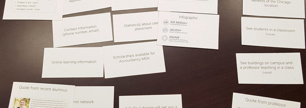
Over 100 cards depicting existing and planned site content—such as free events and information on youth services—were presented to patrons via an interactive web interface. The patrons were then responsible for sorting cards into logical groups, which they named.
After the exercise was completed, we first merged similar group names. For example, “for kids” and “kids” became a single group. We then began looking for patterns in the content clusters.
For this exercise, we used a tool called Optimal Sort by Optimal Workshop. Optimal Sort provides several useful features to streamline the process of pulling insights from the workshop-generated data:
- Dendograms: Tree diagrams which illustrate how cards are clustered within a hierarchy
- Grouping Matrices: Spreadsheets that cluster the strongest card groups together
- Raw Data: Access to all the information for custom insights
Using these tools, we could analyze how patrons grouped library content in ways that made sense to them.
While this data was incredibly helpful in navigation design, we also had to keep in mind that the goal in a card sorting exercise is often to find the biggest points of convergence and the biggest points of disagreement, rather than perfect agreement for all cards between all patrons.
Card Sorting: Disagreements and Challenges
Consensus didn’t always come naturally during these exercises. Here were some challenges we bumped up against.
Categorizing e-books
The 16 participants put e-books into 15 different categories (94%), underscoring the challenge of categorizing e-books within a library website.
Additionally, many people may not know that e-books are available as a free library service, and may just associate these with Amazon purchases. Patrons asked:
- Is it media?
- Is an e-book part of book collections?
- Are e-books related to electronics?
- Should e-books be considered an online resource?
Similarly, the card for “audio books” was categorized 14 different ways.
Beyond traditional collections
The role of a library within a community is complex. In addition to lending out books, music, and films, libraries also provide a wide array of essential services to their patrons. These include:
- Distributing free museum passes to families
- Distributing citizenship information
- Providing notary public service
- And many others…
In our exercise, there was no agreement on how best to categorize these services.
It may be that these public service offerings fall under the radar of library patrons, who may not know they exist. It may also be that the results of our survey were colored by our sample size.
The challenge here is if very few people are looking for something, how can you ensure it is findable in a logical place?
Is a library a brick and mortar location, or hub of services?
Patrons also struggled to understand how to categorize both the home delivery of books, and bookmobiles. This may indicate the possible misconception about the library being solely a physical, brick-and-mortar location versus the hub of an array of community services. The concept of a library being “mobile”, or living outside the actual facility confused patrons.
Similarly, patrons created a number of different categories related to technology. These categories featured titles like:
- Online
- Technological
- Computers and internet
- Computers and internet information
The cards within those groups seemed to indicate a struggle to differentiate between virtual services available from remote locations (such as a patron’s home or school), and the virtual services available to patrons at the brick-and-mortar library location.
If anything, this highlighted the importance of educating patrons on the range of library services that are available to them in their own homes.
The problem with too much information
When stuck, patrons would often turn to the concept of “Information” as a category. This lead to participants creating the following categories:
- General Information
- Library Information
- Information
- Info on the Library
None of these vague categories reached more than 59% agreement across our sample of patrons.
The main takeaway here is that the library should pursue valuable, understandable page names. Information as a category is too vague and subjective to be used on a website where you want to make things easy to find.
Card Sorting: Similarities and Indicators
Age-specific content was grouped similarly by the majority of participants. Given the specificity of the content—for example “teen advisory board—it was not hard for patrons to group these resources into natural categories. This proved our hypothesis that age-specific navigational destinations meet library patron’s expectations and are easy to understand.
The majority of patrons also paired and grouped similar items under “my account”; such as when their books are due, how to put an item on hold, and viewing item renewal policies. This clearly indicates that people want an easily accessible, single destination for all of the information regarding their own personal account with the library.
Credible User Experience Design
Finally, gaining insights from library patrons lent credibility to the navigation choices we made and to the website design overall. The card sorting process ensured that the new site would help patrons find what they need quickly and easily as well as highlight some of the services that patrons may not be as aware of.
We hope that other organizations—both libraries and other institutions with a complex array of offerings—can benefit from knowing more about this process.