Deceptive Patterns to Avoid On Your Website
Every business or organization wants to see increased conversion rates, but some go to extreme lengths. In this post, we explore how UX can be employed to deceive users and exploit their interactions with digital products.
When we work with clients to define goals for the digital products we build on their behalf, a consistent desire for increased donations, purchases, or email sign-ups over time drives many of these conversations. Everyone wants to see a graph of KPIs trending upward, but how far are we willing to go to keep increasing those numbers? Some companies have turned to deceptive practices—or deceptive patterns in UX parlance—to keep the balance sheet in the black.
As a Certified B Corp, Mightybytes is committed to using business as a force for good in the world. As a digital agency, the internet is where we do that. Below are six examples of using UX design as a force for deception. Don’t do these things.
Deceptive Patterns
UX consultant Harry Brignull put up the website Dark Patterns to point out interfaces that are designed to intentionally deceive users. According to his website, “Deceptive Patterns . . . are not mistakes, they are carefully crafted with a solid understanding of human psychology, and they do not have the user’s interests in mind.”
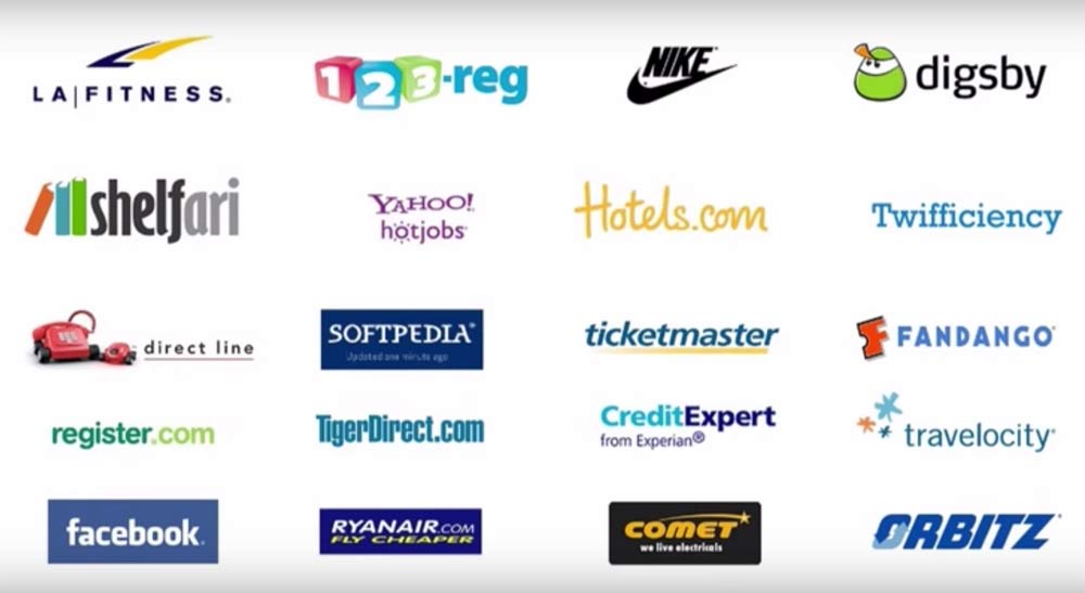
You sign up for a product or service, but can’t unsubscribe. You get tricked into creating an account that then spams your contacts list. Or you click on something that looks like content but in reality is just a disguised ad, or worse, starts downloading software to your device. These are dark patterns. They are all over the internet and not just the domain of independent hackers or nefarious Nigerian princes. Some of the biggest brands around the world employ them liberally.
Mr. Brignull notes that four factors commonly play into deceptive patterns taking shape:
- An aggressive business environment.
- A heavy emphasis on metrics.
- Social proof (i.e. “many big brands are doing it, so should we”).
- Unlike black hat SEO techniques, dark patterns can’t (yet) be detected by software.
The boss says you’ve got to get the numbers up at all costs. He or she points to several other well-known companies doing similar things. Who’s going to know? That’s all it takes. While we are big fans of data-driven decision making, taking metrics obsession to the extreme creates an environment where getting the numbers up no matter what can lead to ill-advised decisions that result in unhappy users and lots of wasted energy.
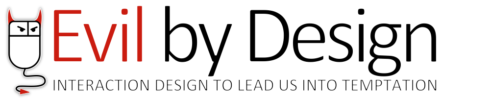
Similarly, in his book Evil by Design: Interaction Design to Lead Us Into Temptation, author Chris Nodder breaks 57 examples of persuasive design patterns meant to manipulate into seven familiar categories:
- Pride: Use social proof to position your product in line with your visitors’ values.
- Sloth: Build a path of least resistance that leads users where you want them to go.
- Gluttony: Escalate customers’ commitment and use loss aversion to keep them there.
- Anger: Understand the power of metaphysical arguments and anonymity.
- Envy: Create a culture of status around your product and feed aspirational desires.
- Lust: Turn desire into commitment by using emotion to defeat rational behavior.
- Greed: Keep customers engaged by reinforcing the behaviors you desire.
These practices all have one thing in common: they prey on our cognitive psychological biases in order to persuade us to do things that are most likely not in our own best interests. Below are six examples.
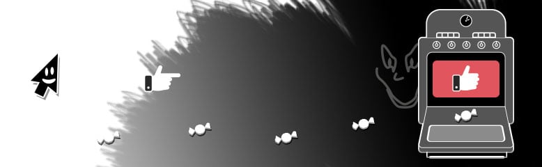
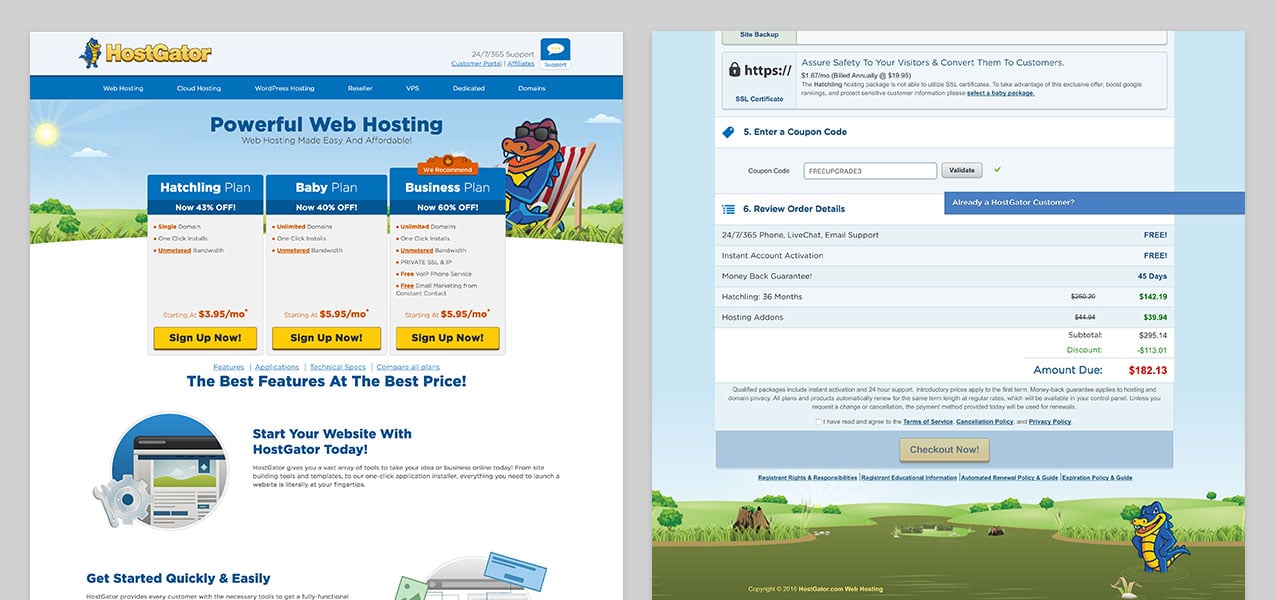
The Roach Motel
Don’t make it easy for users to subscribe but then difficult to unsubscribe. Roach motels are all over the internet and take the shape of newsletter signups, software subscriptions, and so on.
The Bait and Switch
Don’t misdirect users by changing patterns without warning. In other words, if the blue button consistently takes you to the next screen, then suddenly becomes a ‘Buy’ button, users will instinctively click it before realizing that it does something different than the other 19 buttons of the same size and color. Users don’t want to feel they’ve been tricked into taking an action, especially not if it requires spending money.
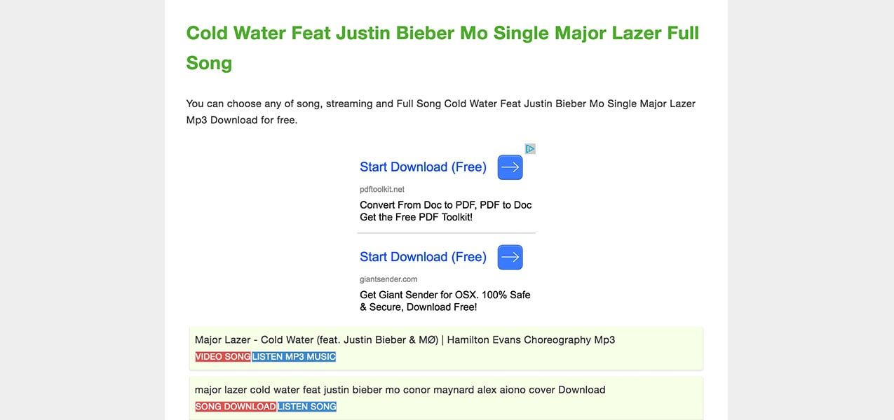
Disguised Ads
Don’t disguise ads as other kinds of potentially more desirable content. Nuff said.
Sneak Into Basket
Don’t slip unwanted items into a user’s cart. A customer purchases a tablet, for instance, and a $20 case is added to the cart to “protect your purchase”. Similarly, some sites will add surprise or hidden costs at the last step in your checkout process.
Trick Questions
Don’t take advantage of the fact that users scan copy on the web rather than reading in detail, as in the case of disguising opt-in buttons as opt-out buttons with misleading copy.
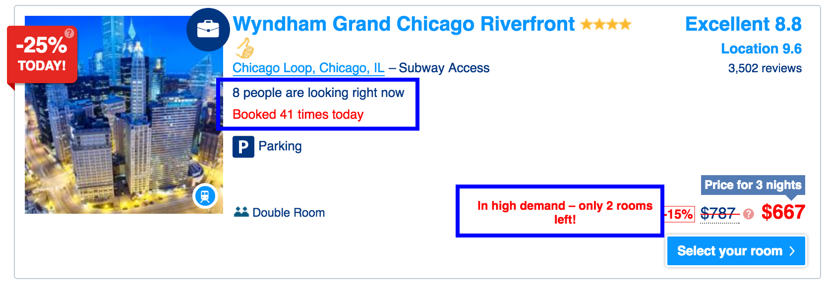
Scarcity Inflation
A common practice used on shopping networks that has found its way to the internet, scarcity inflation preys upon the fact that we humans have emotional biases toward missing out on something. Don’t fake limited availability unless of course there is actually limited availability.
Run Into the Light
These are just a few of examples of deceptive UX patterns that run rampant across the web. Harry Brignull proposes that UX designers adopt an industry-wide code of ethics that not only highlights these practices for the shady deceptions they are but also arms designers with a Hippocratic oath-like response to every time someone in management asks for a dark pattern.
Because of these patterns, users waste untold amounts of time and energy poking around a product or service looking for a way to close their account or fix the “mistake” they just made via an intentional deception that was put in their path. Deceptive patterns undermine integrity and customer confidence in the brands that employ them. Use UX as a force for good, not deception, on your site instead. This post on green patterns, UX practices meant to help users make more sustainable choices might be a good place to start.
Inclusive Experience Design
Learn more about how Mightybytes uses inclusive design strategies to help our clients strengthen stakeholder relationships while meeting their business goals.