Nonprofits: Here’s What Your Donate Page Should Look Like

Nonprofits have an understandably difficult time creating clear and simple donation pages on their websites. While the best way to get the maximum number of people to take a desired action on a web page is to keep the page simple and include a single, clear call to action, nonprofits often have a multitude of meaningful ways supporters can contribute to an organization.
So how do you keep a donate page simple while communicating a complex variety of ways donors can give? We thought we’d take a look some of the ways nonprofits are designing smart donation pages that make it easy to understand the sometimes complicated process of giving.
Distinguish between one-time and monthly donations
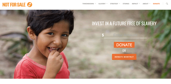
Not For Sale uses two clear, opposing buttons to distinguish between two important types of donation: one-time and ongoing monthly. In addition, this single, transparent form field creates a playful interface that encourages visitors to start typing. Once a user clicks either of the donate buttons a longer form is revealed, but this upfront “handshake” gets people committed to the donation process before form field fatigue sets in.
Use tabs to separate different ways of giving
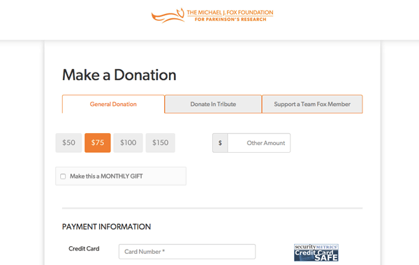
The Michael J. Fox Foundation for Parkinson’s Research solves the problem of too many ways to give by separating giving options with tabs. Each tab’s donation interface is different. Donating in tribute prioritizes the name of the person you’re giving in honor or in memory of (and gives you the option to select either), and supporting a team member starts with a smart search that reveals the names of potential team members as you’re typing, so you can easily find the person you’re donating to.
Payment information and other standard form fields occur below the design elements that distinguish one tab from another. Every tab includes the checkbox option of making your donation amount a monthly recurring gift.
House your Donate page in a “How You Can Help” section
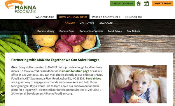
When donors have the option of giving everything from their time to their plasma, nonprofits struggle how to organize all the options on a page. MANNA Food Bank boiled their giving options down to a simple tab structure that starts with “How You Can Help.” The donate page is contained within this navigation, but the drop-down also includes volunteer and advocacy information, as well as options for donating something other than money (food, vehicles, etc.).
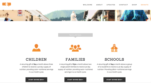
Create distinct giving audiences or assign amounts
Rather than use a form with menu options, RU4Children created a storefront of options using category icons, fixed donation amounts, and “start giving” buttons. It’s not an easy decision to limit the ways in which potential donors can give online, but by limiting choice, you create a cleaner experience for visitors that ultimately ends up in a higher conversion rate.
Let people pick where their donation goes
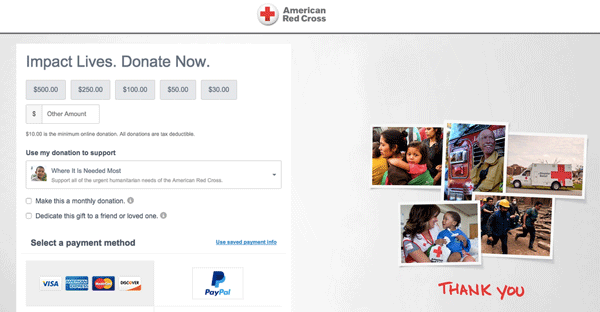
American Red Cross allows donors the option of choosing where their money goes from a drop-down menu that includes local giving, “where it is needed most,” and disaster relief. This online practice reflects best practices in the nonprofit fundraising community that allow supporters to choose how their money is used, and it dramatically improves the trustworthiness of the interface when you can make this same selection online.
How to incorporate best practices on your own site
You may not have the option of updating the design and interface of your donate page today, but think about incorporating some of these ideas the next time you upgrade your site. You can also make incremental changes in your current design by testing your page against Network for Good’s Donation Page Grader.