How to Explain Difficult Concepts with Awesome Web Design

We’ve been working with a host of clients recently who have complicated business structures, or who are disrupting an industry with a simple new way of doing an old job. The stuff they’re doing is awesome, but it’s difficult to explain in full during the five seconds it takes someone to visit a website, figure out what they’re looking at, and decide whether the content is relevant to them.
When you’re working in a complicated industry you have to do just that. You can’t expect website visitors to read several paragraphs of copy that explains why you’re different. You simply have to demonstrate that you are different. We wrote previously about how to write and design copy so that it shows, not tells, your visitors what you’re about. But what are some ideas for how to pull this off effectively?
Let’s take a look at some approaches employed by businesses who are doing this well on their websites.
Highlight Stats
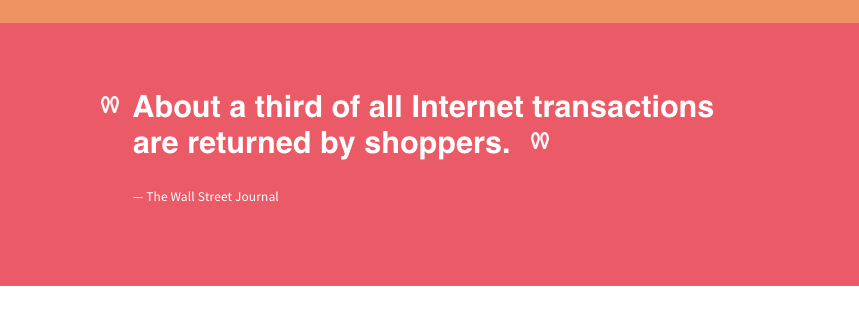
Clothing measurement startup Bourbaki 13’s homepage is a continuous scroll that, about halfway down, presents a statistic, cited in the Wall Street Journal, that sums up the problem their company is trying to solve: about one-third of all internet transactions are returned by customers. Bourbaki13’s solution is to help people take body measurements that map to internet sizing so you can actually shop from the comfort of your living room. The stat is only part of the story Bourbaki 13 is telling, but it’s an important piece that acts as the turning point for driving home the company’s message.
Be Bold and Direct
If you create a bold, stand-alone statement about who you are, people will actually read it. We’ve seen a lot of companies — many of them digital design firms, actually — taking this approach lately. Rather than hiding your organization’s purpose on the About page or breaking it up into a bunch of disparate elements on a homepage carousel, explain it in 30-40 words in 60-point font.
State the Benefits. Simply.
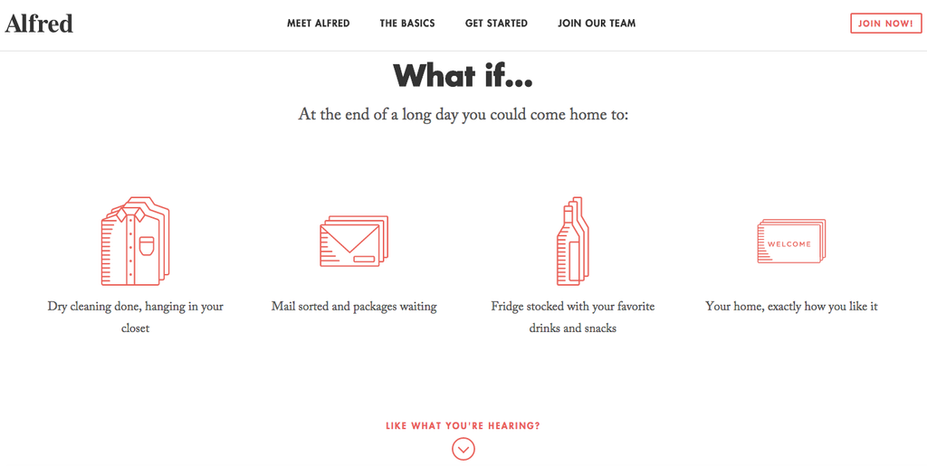
Alfred is a personalized concierge service rolling out in Boston and New York. Starting at $25/week, an “Alfred” will come to your house, straighten up, shop for groceries, do laundry, and basically serve as a personal butler. Awesome, right? But a little hard to explain to folks who aren’t already fully embracing the sharing economy.
But the company blends visual design and copy to present a world that’s different because Alfred exists. Instead of explaining what you do, try explaining how your customer’s life will be different because of your product or service.
Highlight Your Own Stats
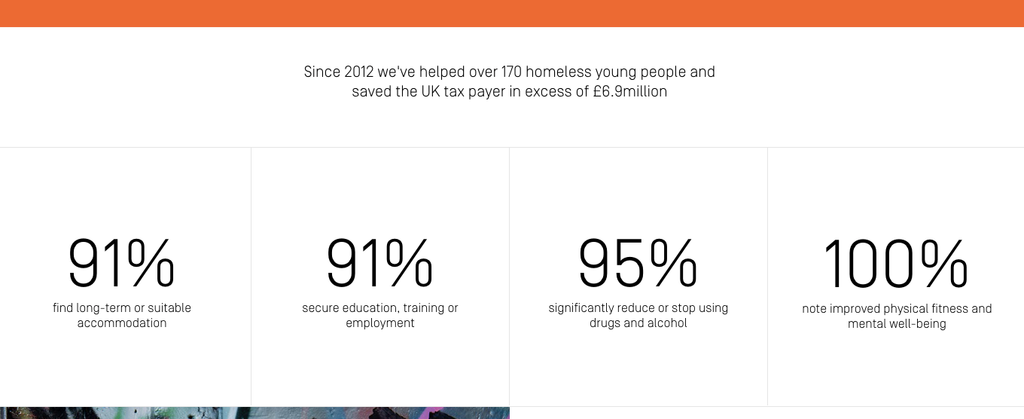
Nothing better explains the effect your organization has on its audience than stats to illustrate it. You may not have precise analytics, but you can think creatively about how to create an infographic about what you do. How many products sold? How many plays produced? How many meals served? How many current customers? Each statistic goes a long way in showing, not telling, what it is that you do.
This example comes from The Running Charity, an organization that helps homeless youth in the U.K.
Include Your Elevator Pitch
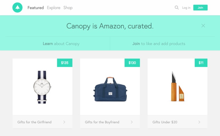
How do you describe your business to potential investors, your in-laws… some rando looking over your shoulder at a coffee shop? It’s probably something like, “We’re Airbnb for yachts,” right? It’s simple, direct, to the point, and people get it right away. Why not use that same copy on your home page? Check out Canopy, which is “Amazon, curated.” It’s not the sexiest tagline every written, but in two words you understand the website’s purpose.
Want to know more about how we can help you develop your digital marketing strategy? Feel free to look at our marketing services.
Sustainable Marketing
Learn more about how Mightybytes uses responsible data strategies and sustainable marketing practices to help you meet your goals.