How Component-Based Design Improves Digital Products
In this article, we cover how component-based design can save time and money while creating a more flexible design system for your website or digital product.
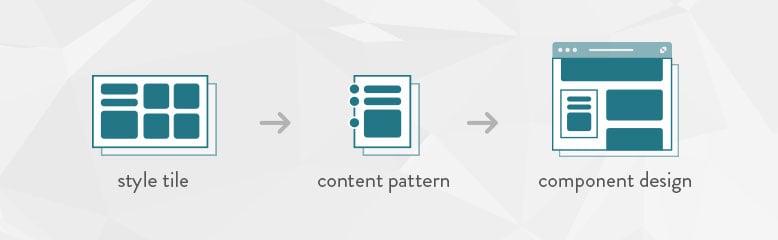
Key Takeaways
- Component-based design streamlines the design process, saving time and money while enhancing flexibility.
- Traditional design comps can confuse clients, whereas style tiles provide a clearer yet more flexible visual direction for projects.
- Content briefs and patterns clarify the purpose of different content types, aiding in efficient design decisions.
- Overall, component-based design promotes collaboration, supports iterative testing, and allows for easier updates over time.
- This approach also empowers clients, enabling them to manage their content with less reliance on designers.
Ye Olde Design Comp
Like many digital agencies, for years we relied on standard design comps as part of a product build or website redesign process. We intended these pixel-perfect visual renditions of key site pages to help clients understand not only how a website or product screen might look but also how it might work.
For many projects, design comps provided important reference points for visual and user interface design. Getting client approval on these comps was a critical part of moving projects forward.
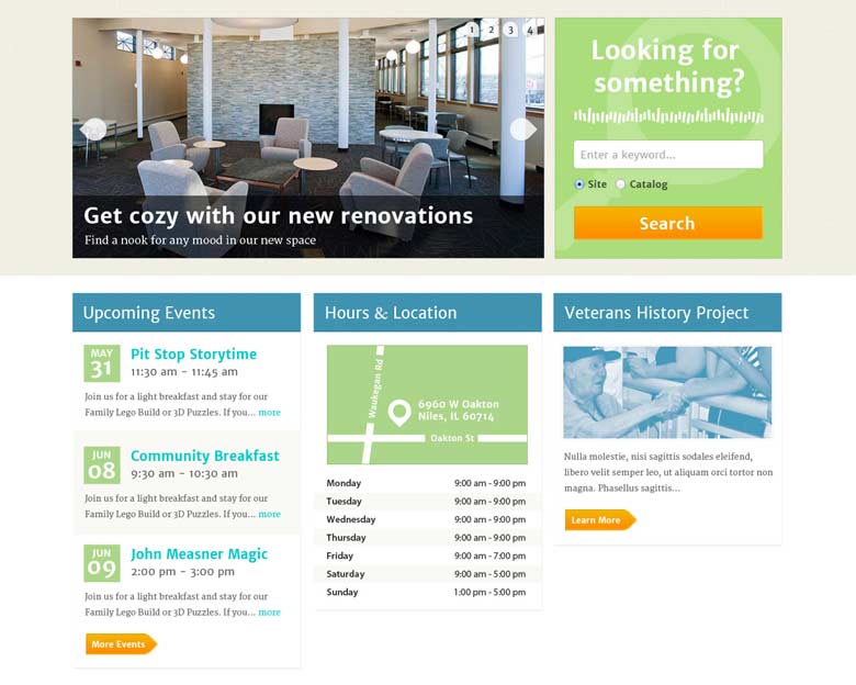
However, as static representations of dynamic content, they also often caused more confusion than enlightenment. Clients were often understandably confused by the process of reviewing just a static screen and projecting what the end result, with all its various features and components, might entail.
Unfortunately, design comps do little to help clients or users understand the broader implications of choices made long before there is anything to interact with. However, there is a better way.
Style tiles form the common visual language between designers and stakeholders and provide a catalyst for discussions around the preferences and goals of the client.
— Style Tiles website
Style Tiles
Now, our earliest post-discovery design deliverables typically include style tiles. These communicate the essence of an online visual brand without getting too mired in the details. Designed specifically for websites and applications, style tiles showcase the most common visual assets of a website, including:
- Fonts and typography
- Color palettes
- Image styling
- Illustration or iconography
- Interface elements, such as form fields or pulldowns
- And so on…
Style tiles help client and agency create consensus on the visual language used to design various components of a digital product or service. Also, because they are independent of layout or user experience, style tiles can help project stakeholders better understand how site components will be styled.
An existing style guide or brand book is very helpful for creating style tiles. For example, font choices and color swatches already exist for other mediums. Design teams create style tiles to translate how those guidelines will look on the web.
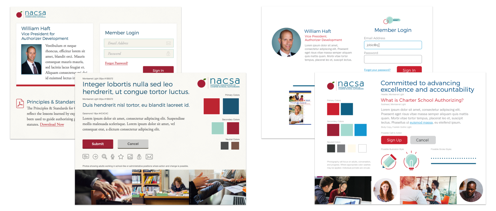
Also, style tiles provide designers and product teams an early opportunity to review potential web accessibility issues, such as legibility or color contrast, that could arise as print-based style guides move to the web. (You might be surprised by how often this happens.)
Plus, tile elements form the basis of styles defined in cascading stylesheets, which control the look and feel of an entire site or product. More importantly, as many content management systems have moved to a component-based approach for managing content, style tiles better represent how these systems will actually work.
Replacing Design Comps
Do style tiles replace design comps? They do not. Design comps still have their place. They can be useful to help teams visualize how various components might be mixed and matched across pages.
However, using component-based design negates the need to create comps for all pages or templates. Instead of creating snapshot of an individual moment in time, over and over again, you create a toolkit that empowers project stakeholders to do better work, faster.
More importantly, by using a component-based approach to website or product design, you don’t have to rely on design comps as the single source of truth. Remember, most pages will, ultimately, change many times over with an organization’s evolving needs. Design comps do a disservice to that fact.
Content Briefs and Patterns
Similarly, every site is made up of different types of content:
- Hero images
- Banners
- News feeds
- Events
- Blog posts
- Videos
- Downloads like templates or white papers
- Call-to-Action (CTA) blocks
- Related content
- And so on…
These content types are often displayed in different ways, depending on where they live on a page and the device on which they are displayed. This can present multiple challenges, given the vast array of platforms, browsers, and assistive technologies we collectively use to experience content.
Content Patterns
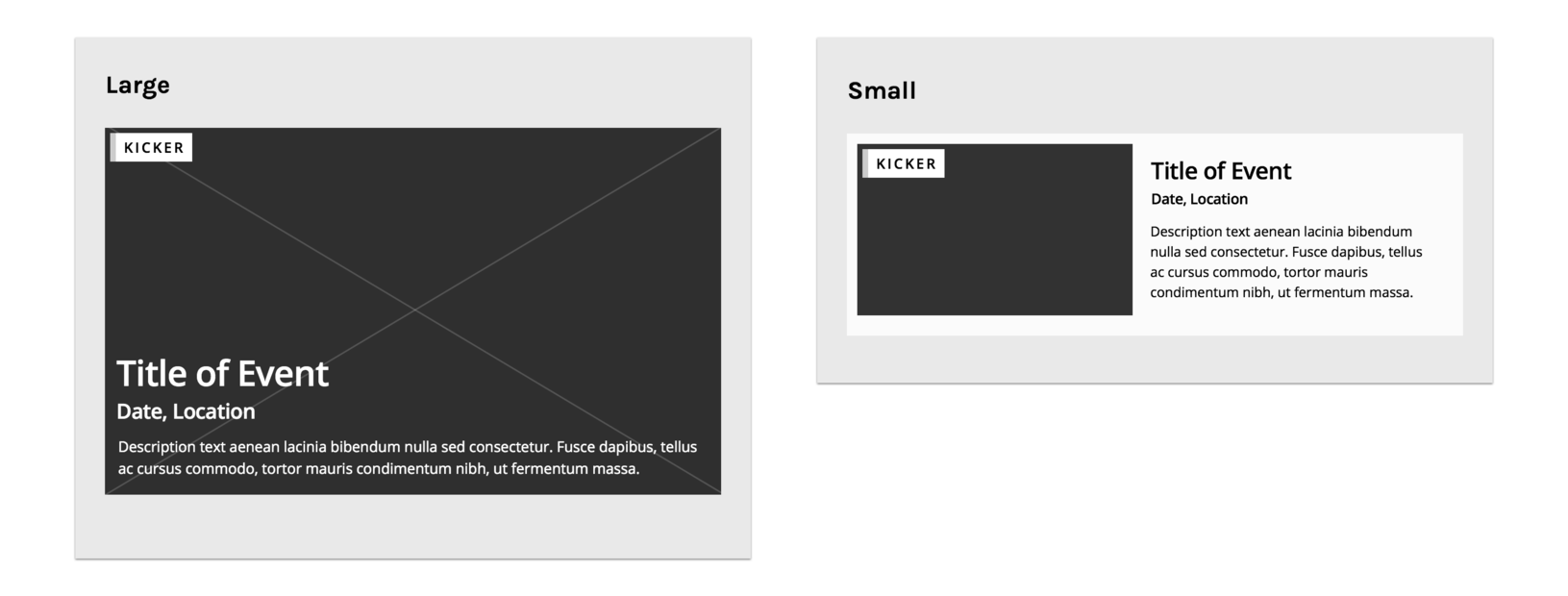
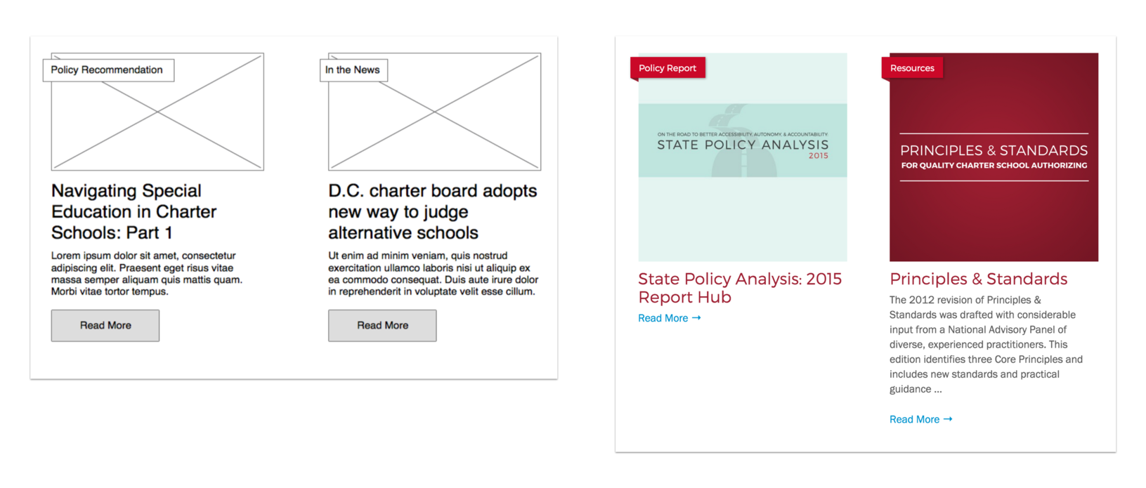
Content patterns show how information for each content type is displayed. Think of them as mini-wireframes.
For example, let’s say you are a company that throws a lot of events. You may want event announcements on your homepage, in a sidebar on your blog, or in a footer on key strategic pages.
While all these announcements could potentially promote the same event, they will each have unique content patterns that define their size, type, and layout, depending on where they live or the display resolution of an end user’s device.
Across the web, you will notice dozens of common content patterns that are used over and over again. This is a good thing. It improves usability and makes the web more reliable. However, it can also make the web look homogenized.
Content Briefs
Content briefs help designers and product teams understand a piece of content’s purpose in light of an organization’s overall content strategy. They are short documents that describe a component or page’s purpose.
At the component level, content briefs highlight important metadata about a piece of content, such as schema information or conversion goals. This can be helpful when trying to rank in generative AI tools or when setting up analytics tracking strategies, i.e. This CTA block drove x conversions during the month of May.
Used at the page level, content briefs help both client and agency answer several important questions:
- Why does this content exist?
- How does it support our content strategy?
- What is this content’s conversion goal?
- What is minimum amount of content that users need to understand what this content is about?
- What is the list of supporting information, like metadata, target keyphrase, assets needed, and so on?
Finally, content briefs can be created in tandem with a content audit to help teams achieve clarity about their own resources or constraints. They are part of a content first approach to building digital products. In creating them, the content workload becomes much clearer. Briefs also give design teams a helpful set of guidelines by which to create page layouts with designed components.
Content Briefs
Related content: Learn how content briefs can streamline the process of designing content for the web.
Display Patterns and Component-Based Design
Content patterns and display patterns serve different purposes. Display patterns show how a content type will be displayed to fit within the visual design system defined during the style tile process. Unlike content patterns, display patterns do include visual design elements, like fonts, colors, photography, and so on.
Component-based design is a concrete implementation of these patterns. With display patterns and component design, rigid full-page templates are less necessary.
By building a library of content and display patterns that can be applied to specific components, you can create a modular design system that lets you mix and match components for optimal flexibility.
When thinking about patterns, content strategists are primarily thinking about content patterns, designers are primarily thinking about display patterns, and front-end developers are responsible for bringing the two together.
— Dan Mall
Once you have a library of approved patterns and components, content brief directives will help teams choose which are most relevant to suit a page’s unique purpose.
What’s more, if an agency also includes a design system with the project, the process of building entirely new blocks or components becomes a lot easier. With color HEX values, code snippets, and copy/paste design elements ready to go at a moment’s notice, consistency over time becomes second nature.
Design Systems
Related content: Learn how design systems support a component-based approach to building and maintaining digital products and services.
Empowering Clients with Component Libraries
Component design is beneficial to clients as well. With a library of built-in and custom blocks to choose from, creating pages is something a client can do on their own with minimal design consulting versus a process entirely owned by the agency. We’ve found that clients find this very empowering.
Plus, once a site goes live, the flexibility inherent to component-based systems makes the process of creating new unique pages much easier. Longer term, without oversight, this may cause design drift, but that’s another post for a different time.
Design Review in the Age of AI
Finally, AI tools can streamline design review processes. Design prototypes can often be created on the fly in a workshop setting, which saves time and supports consensus-building.
However, these prototypes may not be fit-for-purpose to use in real world production. Plus, initial reactions may not stand the test of time as a pretty design transitions into an actual product that people need to use. Over time, this can lead to usability issues, technical debt, frustrated customers, increased costs, and a slew of other problems.
Plus, because they are trained on common design and content patterns used across the web, AI-powered design tools also run risk of homogenizing the solutions we create. One one hand, in tandem with web standards, established patterns make the web easier to use. On the other, this can undermine your brand’s potential to stand out in a sea of cookie-cutter interfaces.

Adding Human Perspectives
With this in mind, always be careful to imbue automated processes with human creativity and oversight. Sometimes, this can be as simple as asking a few questions:
- How might we make this better?
- Might a machine-produced design alienate important stakeholders?
- Similarly, will a prototype present technical or accessibility issues once we move it into production?
- Will this help us stand out?
- Do we need to test this with real users?
- What’s our level of confidence that this design hits the mark?
Other times, an automated process might not produce the results you want. At that point, your team might need to go back to the drawing board. Literally.
Vibe Coding Your Designs
Related content: Understand the benefits, potential pitfalls, and ever-changing realities of using AI tools to ‘vibe code’ your next website or digital product.
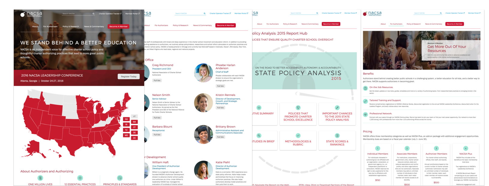
Bringing It All Together
How does a component-based design approach work in practice? This might seem like a lot of steps to go through when a designer can create several comps in a much shorter amount of time.
However, don’t underestimate the power of achieving consensus through this process. The time you use up front designing individual blocks or components more than makes up for the time you save during QA and pre-launch processes. Traditional ‘waterfall’ design processes can require numerous pre-launch revisions due to static comps not matching dynamic, production-ready interfaces.
Plus, by using component-based design processes, we empower our clients to own their content and pages. As subject matter experts, they’re often the best candidates to do this. Client teams can mix and match components from a visual system to create new pages without hiring a team of designers and developers.
Improving Design Processes
This process works better than the age-old design comp process for a few important reasons:
- Collaboration: Participatory design processes allow project stakeholders to reach consensus faster.
- Time-saving: The overall process takes less time because we build consensus and implement design revisions faster.
- Iterative testing: By incorporating stakeholder perspectives throughout, these methods democratize and validate product designs.
- Flexibility: These systems are flexible and modular. Individual components can quickly change without bringing the entire system down.
- Sustainability: Reusing components across a site caches them in your browser, reducing the amount of data that needs to be transferred across the wire as users navigate from page to page.
The process of creating a library of mix and match components informed by styles tiles and content patterns can cut down significantly on back-and-forth correspondence between client and agency.
Sustainable Web Design
Related content: Component-based design is part of a more sustainable approach to building digital products and services. Learn more in our handy guide.
The Waterfall Design Trap
It can be easy for people on both client and agency side to fall into the Stockholm Syndrome trap of waterfall-based design. Design comps employ well-established methods to help designers communicate value. People expect them.
However, in the wrong hands, design comps are also potentially problematic, causing more confusion than understanding. Plus, they tie product teams into developing and launching something that may not be fit-for-purpose once an approved design goes into production.
Over time, new approaches revolutionize design implementation. Component-based design is one such approach. It empowers project stakeholders to create systems that are more flexible, save time, and yield better results over time.
Frequently Asked Questions About Component-Based Design
For easy reference, here are answers to five of the most common questions we receive about component-based design.
Absolutely. While designing a library of individual components may require more time up front, you will more than make up for that due to stakeholder consensus-building that occurs throughout the process. Plus, as new needs arise—and they will—you may only need to design a new component rather than an entirely new template or page type.
Many popular content management systems, including Drupal and WordPress, which powers nearly 50% of the web, support component-based design. WordPress’ block-based editor, Gutenberg includes a helpful selection of default blocks. Plus, its library is also infinitely customizable. Chances are, if you can envision a feature your website needs, a good product team can build a block for it.
Even if you don’t use a component-based content management system, like WordPress, there’s a good chance your website already utilizes blocks or components. Call-to-action blocks, newsletter signups, event callouts, and page heroes are all examples of common components. Start by creating an inventory of components on your existing site, then use that to identify new features that might utilize component-based design. Also, a whiteboard or presentation tool can help you mock these up using simple shapes, like boxes and arrows. Better yet, involve your entire team in the process.
Automated design tools that employ AI are evolving quickly. Platforms like Figma and others offer easy-to-use features that can help you prototype components like content or display patterns. However, these tools are only as good as the code they generate. For example, using AI-prototyped components in production can lead to technical debt, accessibility issues, and numerous other problems. Always incorporate human oversight into AI-enabled processes.
Component-based design enables you to reuse components across pages, improving page performance through caching. Plus, lightweight assets like SVGs or CSS styles, utilized within components, can pack a visual punch without downloading large assets like images. Finally, utilizing a component-based approach will also extend a website’s shelf life since you often update individual components rather than fully redesigning your site.
Inclusive Experience Design
Learn more about how Mightybytes uses inclusive design strategies to help our clients strengthen stakeholder relationships while meeting their business goals.