Our Brand
Guidelines
Use these brand guidelines to maintain consistency when communicating across channels about Mightybytes and its initiatives.
Our Mission
Mightybytes is on a mission to make the web more accessible, sustainable, and a better place for everyone.
Our Brand
Values
To advance our mission, Mightybytes incorporates the following principles into our business operations, culture, initiatives, and company communications.
Sustainable
We measurably improve performance, efficiency, and environmental impact.
Accessible
We provide inclusive experiences that reduce barriers to information access and opportunities, especially for people with disabilities and other marginalized communities.
Educational
We educate key project stakeholders to help them build skills and capacity.
Responsible
We incorporate the latest data privacy, digital governance, and security best practices.
Measurable
We drive continuous improvement over time toward well-defined goals.
Code of Ethics
Related content: Learn more about how Mightybytes prioritizes the values above in our company’s Code of Ethics.
We are a Certified B Corp
Being part of the global B Corp movement to use business for good plays a big role in our communications and company identity.
Our B Corp Impact Hub clearly outlines company policies and commitments necessary to maintain this certification.
Impact Business Models
The company has three Impact Business Models (IBMs) that inform shared value we create for stakeholders.
These IBMs support the company in our brand values, finances and operations, and through B Corp certification standards.
Sustainability
What it means: Sustainability practices are woven by default into projects clients hire us for.
Inclusive Design
What it means: We prioritize diverse stakeholder perspectives and incorporate privacy, security, accessibility, and responsible governance practices into every project we deliver, reducing risk and improving chances for shared success.
Education
What it means: We improve access to information and opportunities on any project to make education a cornerstone of an equitable and more sustainable future.
Who We Serve
Mightybytes serves purpose-driven companies, social enterprises, nonprofits, and civic agencies committed to building a regenerative and more equitable future that works for everyone. This is sometimes referred to as the ‘Impact Economy’.
Communications
Guidelines
Use the following guidelines to maintain communications consistency across channels and touchpoints.
Steady-State: Our Content Strategy
The company’s content strategy serves our education IBM and guides internal and external communications based on principles outlined in these guidelines.
Publishing Guidelines
Our publishing guidelines describe voice, tone, grammar, and other content and editorial requirements necessary to maintain consistency in our communications.
Company
Logo
Download Our Logo
Download a ZIP file of dark blue and white Mightybytes logos in your preferred format.
Typography
Use these type styles when creating page content on the website and in other visual communications.
Fonts
Mightybytes uses two primary fonts in our visual communications:
- Bricolage Grotesque: used for larger headings
- Helvetica Neue: used for smaller headings and body copy for improved legibility
If the above fonts are not available, default system fonts (Arial, Helvetica, etc.) are used as backup to minimize additional data transfer.
Headings
Use these headings to create content and document hierarchy that works for both humans and machines.
H1
- font-family: Bricolage Grotesque;
- font-weight: 800;
- font-style: ExtraBold;
- font-size: 70px;
- leading-trim: NONE;
- line-height: 81.2px;
- letter-spacing: 0%;
H2
- font-family: Bricolage Grotesque;
- font-weight: 800;
- font-style: ExtraBold;
- font-size: 48px;
- leading-trim: NONE;
- line-height: 55.68px;
- letter-spacing: 0%;
H3
- font-family: Bricolage Grotesque;
- font-weight: 800;
- font-style: ExtraBold;
- font-size: 36px;
- leading-trim: NONE;
- line-height: 41.75px;
- letter-spacing: 0%;
H4
- font-family: Helvetica Neue LT Std;
- font-weight: 750;
- font-style: 85 Heavy;
- font-size: 26px;
- leading-trim: NONE;
- line-height: 30px;
- letter-spacing: 0%;
H5
- font-family: Helvetica Neue LT Std;
- font-weight: 750;
- font-style: 85 Heavy;
- font-size: 21px;
- leading-trim: NONE;
- line-height: 42px;
- letter-spacing: 0%;
H6
- font-family: Helvetica Neue LT Std;
- font-weight: 750;
- font-style: 86 Heavy Italic;
- font-size: 18px;
- leading-trim: NONE;
- line-height: 42px;
- letter-spacing: 0%;
Banner
Text
In instances where you need display text with extra visual impact, you can break the text into banners by combining type sizes and accent colors.
The smaller text should be the base of the heading (i.e. 48px for an H2) while the larger text should be 214% of the smaller value (i.e. 102.72px).
On the Website
- Choose the custom ‘Stack’ block in WordPress to set this up.
- Adjust font size using the block Typography panel (Large on top, XL on bottom).
- Choose color options in the Styles panel.
- Also, remember to maintain good content structure by adjusting banner text headings (h2, h3, etc) to match document hierarchy.
Colors
Use the palettes below to communicate value through color. Please note that the colors will change depending on whether the site is in light or dark mode.
Primary Colors
This is the primary palette. Use these colors for most Mightybytes-related visual communications.
Secondary Colors
Secondary colors should be used sparingly for highlights and to separate an item from other elements on a page.
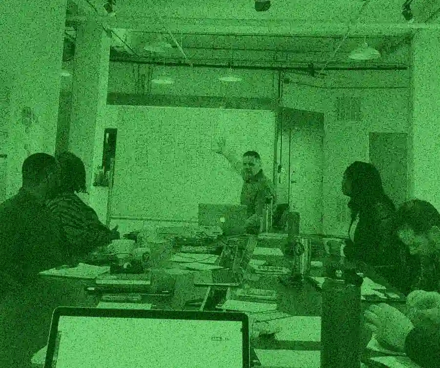
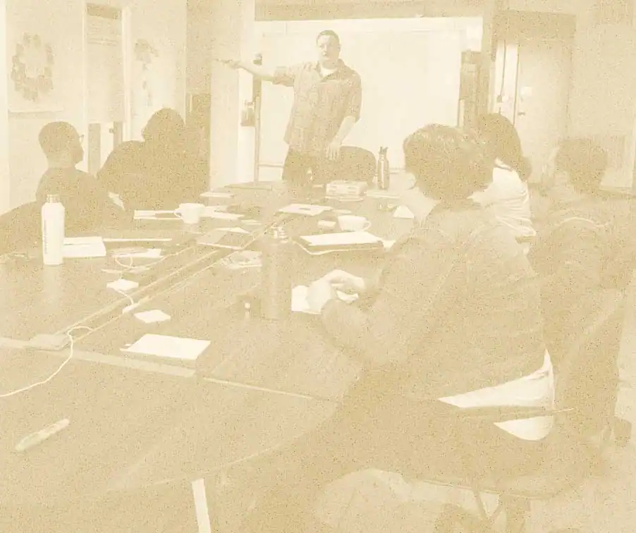
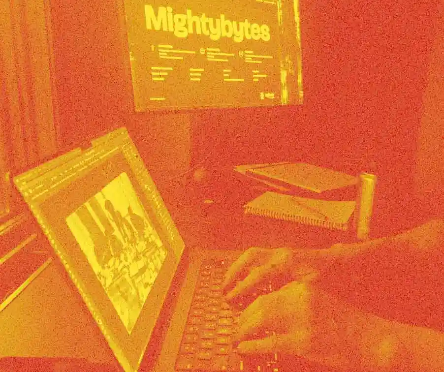
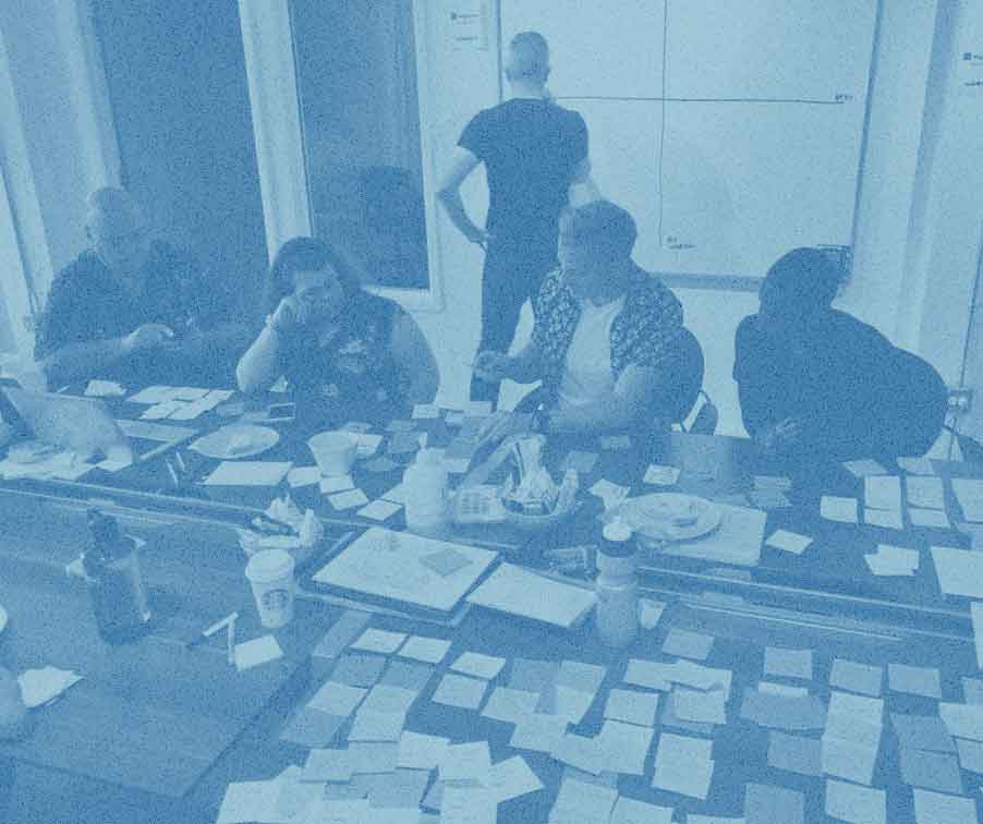
Photography
Hero images and photos are treated with various duotone colors from the palette above. Grain is added to maintain smallest possible file size while also compensating for artifacts that come with heavy image compression.
- Website photos are used sparingly to keep page size down.
- Make sure they communicate value relevant to page content.
- When adding grain, you may need to adjust amount based on photo fidelity.
- When compressing images, find an acceptable balance between image fidelity and file size.
- Digital images are delivered via the website using modern formats (WEBP, AVIF, SVG, etc.) whenever possible.
- If you need a Photoshop template, contact us at the bottom of this page.
To compress images for the site:
- Export a high-quality image (no visual compression artifacts) in a standard web format (PNG, JPG, etc.) at the size you need.
- Upload the file to an online image converter (Picflow is nice).
- Convert the file with an acceptable output quality in either AVIF or WEBP format. (AVIF at an output quality of 50% from Picflow tends to produce small file sizes that look good.)
- Goal: Export the highest possible image quality (few to no visually identifiable compression artifacts) at the smallest possible file size.
Icons
Inline SVG icons convey meaning, reduce page size and server calls, and help people with reading or other cognitive disabilities more easily understand content. Examples below.
Primary Icons
Use primary icons on top level pages to communicate key concepts about Mightybytes, our services, process, and so on.
Digital Strategy
Experience Design
Product Development
Marketing
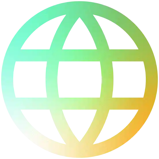
Accessibility

Sustainability
Education
Process
Green Icons
Use green icons in call-to-action blocks, accordion menus, and other areas to convey meaning and support content.
Example:
Small CTA block with icon.

Brand Questions?
Please reach out to Joana if you have any additional questions about how to use our brand guidelines in your communications.