Better Component-Based Design Solutions with Style Tiles and Content Patterns
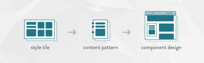
In this post we’ll talk about how style tiles, content patterns, and component-based design can save time while creating a more flexible design system for your website or digital product.
Ye Olde Design Comp
Like many design firms, for years we delivered standard design comps—pixel-perfect visual renditions of key site pages—for visual and interface design on website projects. Getting client approval on those comps was a critical part of moving projects forward. Yet design comps only represent a single state of a single page at a single point in time, so clients were often understandably confused by the process of reviewing just a static screen and projecting what the end result might entail. Design comps do little to help clients or users understand the broader implications of choices made long before there is anything to interact with.
Style Tiles
At Mightybytes, our earliest design deliverables are style tiles, which communicate the essence of an online visual brand without getting too mired in the details. According to the Style Tiles website:
Style tiles form the common visual language between the designers and the stakeholders and provide a catalyst for discussions around the preferences and goals of the client.
Designed specifically for websites and applications, style tiles include the most common visual assets of a website: font, colors, image styling, interface elements, and so on. Their purpose is to help client and agency find consensus on the visual language used to design various components of a digital product or service. Because they are independent of layout or UX, style tiles can help everyone on a project better understand how site components will be styled.
An existing style guide or brand book is very helpful for creating style tiles. Font choices and color swatches already exist for other mediums. Design teams create style tiles to translate how those guidelines will work on the web. They also create styles for iconography, image treatments, buttons, and other common interface elements. Those elements then form the basis of styles defined in cascading stylesheets, which control the look and feel of an entire site.
Content Patterns and Page Briefs
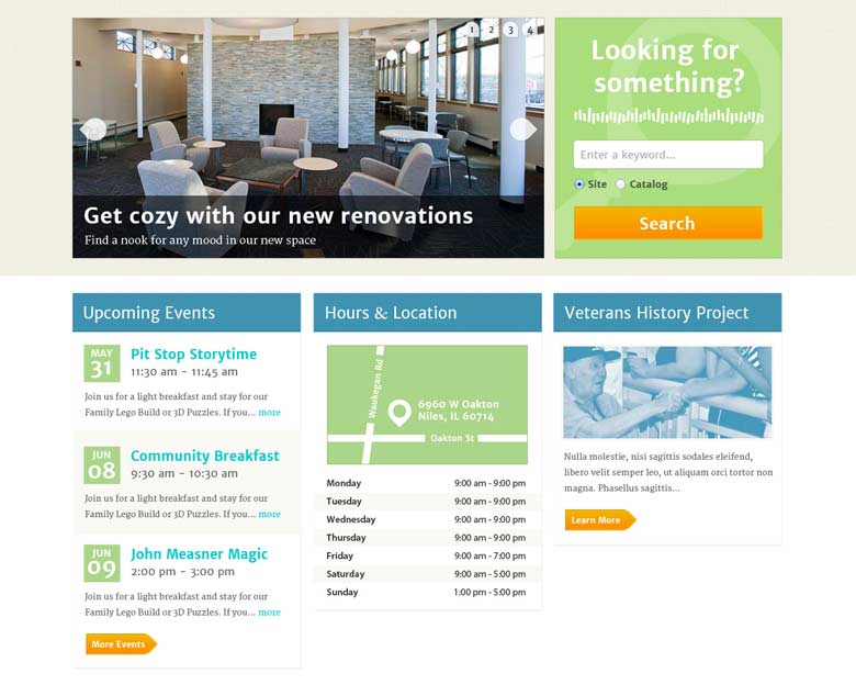
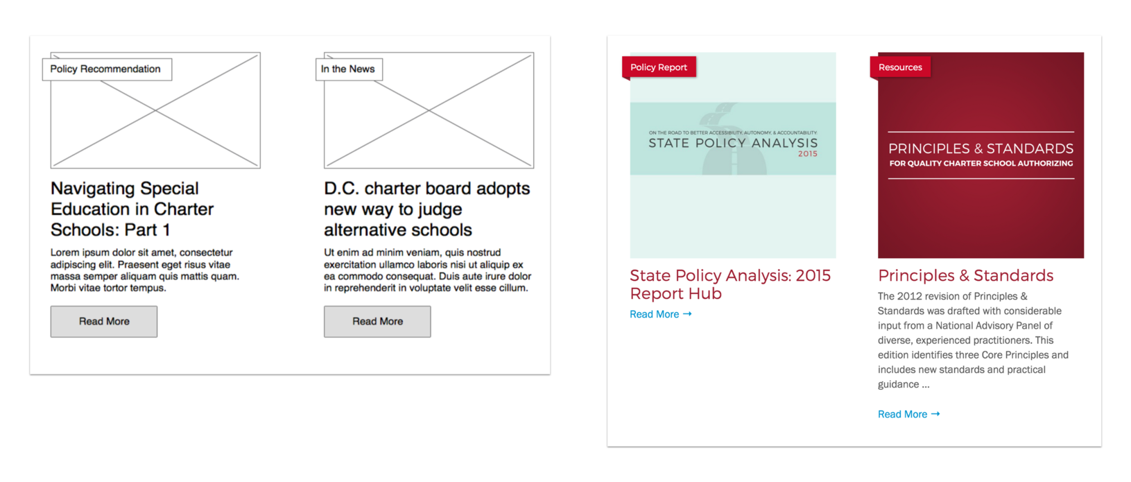
Every site is made up of different types of content: hero images, banners, news feeds, events, blog posts, videos, white papers, and so on. These content types are often displayed in different ways, depending on the page in which they exist. Content patterns show how the information for each content type is displayed.
For example, let’s say you are a company that throws a lot of events. You may want event announcements on your homepage, in a sidebar on your blog, or in a footer on strategic key pages. While all these announcements could potentially promote the same event, they will each have unique content patterns that define their size, type, and layout.
There are dozens of common content patterns that designers keep handy for website designs. Have a look at your favorite sites and you’ll probably be able to spot familiar patterns which are commonly used all over the internet.
Page briefs, on the other hand, do work at the page level rather than the individual content type level. A page brief works exactly like it sounds. It’s a short document that describes each page’s purpose and includes specific conversion goals. Page briefs help both client and agency answer several important questions:
- Why does the page exist?
- What is the page’s conversion goal?
- What is minimum amount of content that users need to make that conversion?
- What is the list of supporting info?
Page briefs can be done alongside a content audit to help content creation teams achieve clarity about their own resources or constraints. They are part of a content first approach to building digital products. In creating them, the content workload becomes much clearer. Page briefs also give design teams a helpful set of guidelines by which to create page layouts with designed components.
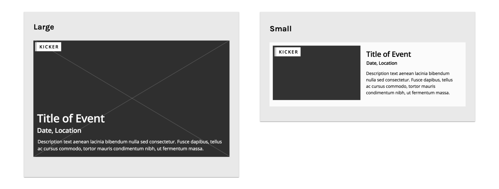
Display Patterns and Component-Based Design
A content pattern is different from a display pattern, which shows how that content type will be displayed to fit within the visual design system defined during the style tile process. Component-based design is a concrete implementation of these patterns. With display patterns and design components, rigid full-page templates are less necessary. By building a library of content and display patterns that can be applied to specific components, you can create a modular design system that lets you mix and match components for optimal flexibility.
Once you have a library of approved patterns and components, directives from your page briefs will help you choose which are most relevant to suit the page’s conversion goals. Component design is beneficial to clients as well because once a site goes live, the flexibility inherent to this system makes the process of creating new unique pages much easier.
So how do we make component-based design work for a team? Who does what? In a blog post titled Content and Display Patterns, author Daniel Mall notes:
When thinking about patterns, content strategists are primarily thinking about content patterns, designers are primarily thinking about display patterns, and front-end developers are responsible for bringing the two together.
At Mightybytes, our content, design, and development teams work very closely with each other and with our clients to ensure that all parties clearly understand both the goals of and steps to execute a successful website visual design system using these artifacts.
Bringing It All Together
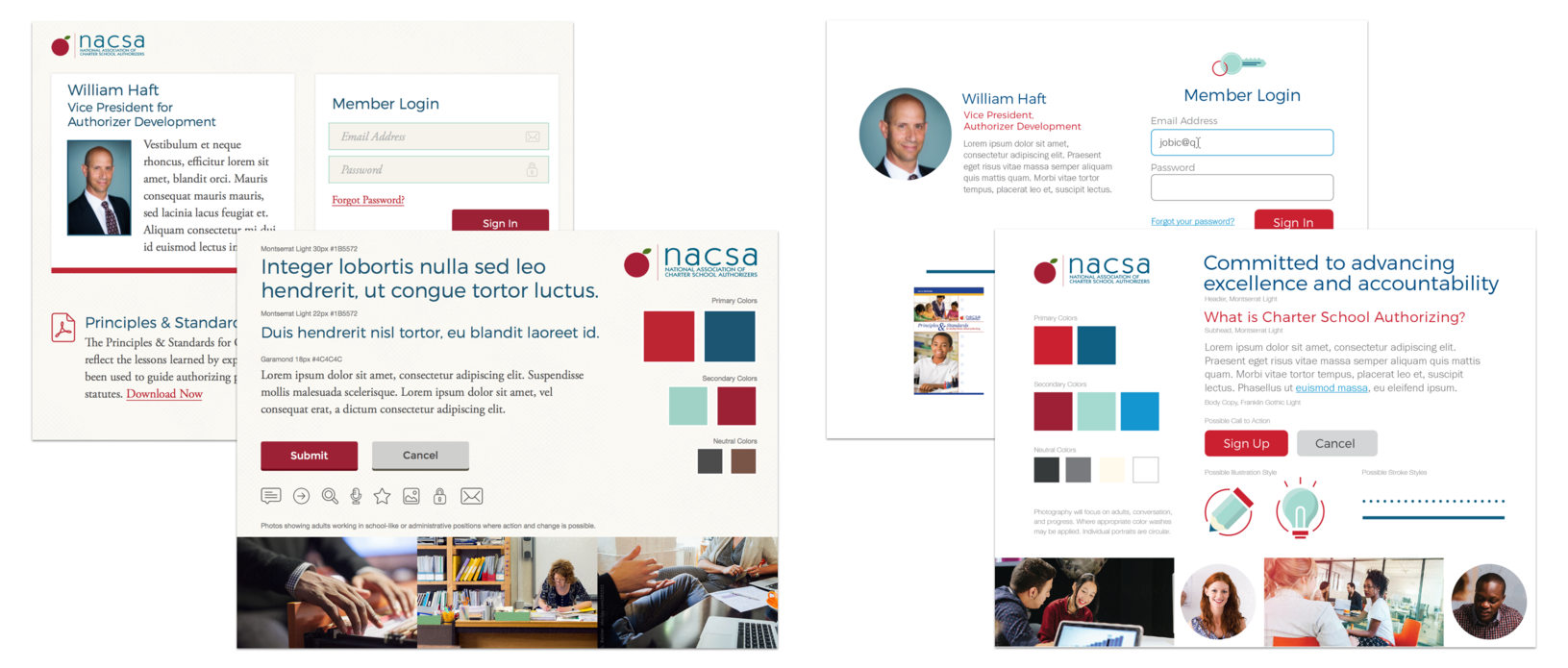
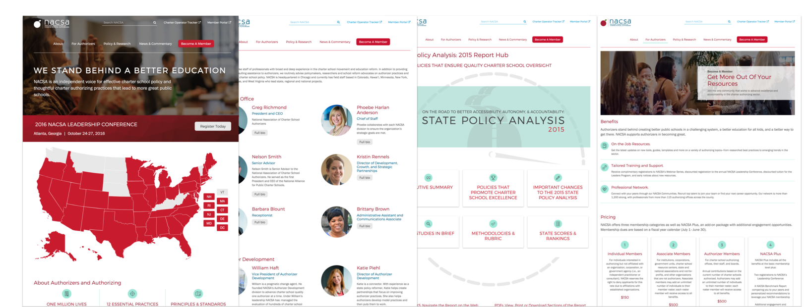
What does this look like in practice? In the example below, our client NACSA mixed and matched components from the visual system we designed to create a new page type without our help, saving them time and money in the process.
Why a Component-Based Design Process is More Efficient
This process works better than the age-old design comp process for a few reasons:
- Collaboration: iterative collaboration allows web teams and clients to reach consensus faster and at multiple times throughout the design process.
- Time-saving: the overall design process takes less time because as revisions come up they can be implemented faster.
- Testing throughout: testing methods validate decisions with real users throughout the process rather than at the end.
- Modular flexibility: these systems are meant to be flexible and modular. Individual components can be changed quickly without bringing the entire system down.
The process of creating a library of mix and match components informed by styles tiles and content patterns can cut down significantly on back-and-forth correspondence between client and agency like the design comp process described at the beginning of this post. This ultimately saves time and resources.
It can be easy for people on both client and agency side to fall into the Stockholm Syndrome trap of waterfall-based design. Human nature often keeps us within our comfort zones, applying old methods to new mediums, but the reality is that rarely works. People still try to shoehorn the print design process into web projects, but time and time again they fail, or at the very least go wildly over budget. With this component-based design approach, Mightybytes creates design systems that are more flexible, save time, and yield better results.
 Tim Frick founded Mightybytes in 1998 to help mission-driven organizations solve problems, amplify their impact, and meet business and marketing goals. He is the author of four books, including Designing for Sustainability: A Guide to Building Greener Digital Products and Services from O'Reilly Media. Connect with Tim on LinkedIn.


