How to Use a Google Analytics Dashboard to Track Your Marketing Funnel
In this guide, you’ll learn how to set up a custom Google Analytics dashboard to properly track marketing performance and focus on the metrics that matter most to your business.
Quick. How is your organization’s marketing doing?
Most organizations struggle to answer that question. It’s deceptively complicated. Asked on Tuesday, you might talk about your last branding initiative. On Thursday, you might discuss the size of your email list. Some days you might shrug your shoulders with “I’m not really sure…”
When you have little idea how well your marketing efforts perform, they can’t succeed for long.
This can be a tough question but it’s critically important.
Setting up a Google Analytics custom dashboard, like the one we’ll show you below, will help you answer a few important marketing questions:
- How many new people learned about us?
- How many new leads did we add?
- How many new customers and sales did we close?
- How much money did we make?
In this guide you’ll learn how to set up a custom dashboard in Google Analytics that you can use to answer the question above on demand. We’ll also cover the right way to assess your marketing performance and stay focused on the metrics that matter most to your business or organization.
So let’s get started.
Effective Marketing Begins With a Funnel
What’s the value of 80,000 website visitors this month? That depends on many factors.
For example:
- If 80,000 is an increase from 70,000 the previous month, but the number of leads generated decreased by 5%, that could be a sign of poor quality traffic.
- If 80,000 is an increase from 40,000 the previous month and is due to a national news segment, it’d be important to wait and see what the new baseline looks like.
- If 80,000 is consistent with the previous six months, it may indicate your marketing is stagnating.
A single datapoint isn’t useful without context.
Evaluating marketing performance works better when you map data to a customer’s journey, from them not knowing who you are to becoming a loyal brand advocate. Marketing goals and data types change significantly as someone moves through your funnel, so it’s important to evaluate each step individually.
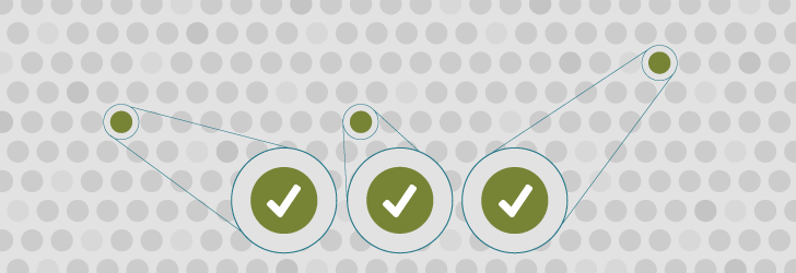
All organizations are different, but all marketing systems can be described with the following four funnel steps:
- Awareness (also called “Top of Funnel” or TOFU)
- Evaluation (also called “Middle of Funnel” or MOFU)
- Conversion (also called “Bottom of Funnel” or BOFU)
- Post-Conversion (also called Referral & Revenue)
For this exercise, we’ll build a Google Analytics dashboard that highlights the first three steps.
Google Analytics Dashboard Snapshots
Note 1: If you’d prefer not to build the Google Analytics custom dashboard yourself, you can import this dashboard directly into your Google Analytics by clicking here. You will need to update the goal widgets to match the goals you have set up in your Analytics account.
Note 2: This guide uses Google’s demo analytics account. If you’d like to follow along, log into Google Analytics and then add the demo account here: https://analytics.google.com/analytics/web/demoAccount
The goal of a Snapshot Dashboard is to give you a quick and easy way to understand what’s going on with your digital marketing at a high level. You should use it to answer a few questions:
- Are my marketing efforts helping me reach my business goals?
- Are the stages of my marketing funnel working together?
- Are my metrics predictable or are they random?
For our purposes here, I’ve selected two common metrics for each stage in your funnel to build out a custom Google Analytics dashboard. Your organization is unique, though. Different metrics may better suit your needs than those I’ve chosen here. Important data may live outside of Google Analytics, for example. You may find that something like Google’s Data Studio or Databox serves your needs better.
But first, let’s build.
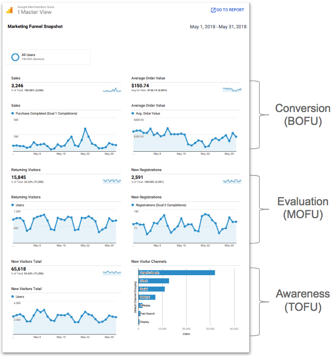
Our Marketing Funnel Snapshot Dashboard consists of three rows, each representing a stage in your marketing funnel. Each stage highlights two high-level metrics.
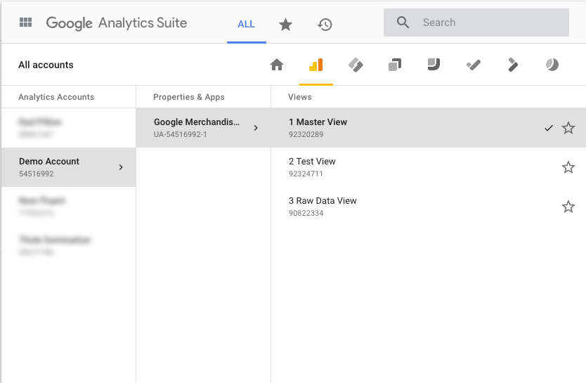
Step 1: Create a New Google Analytics Dashboard
Custom dashboards are set up on the View level in Google Analytics. Navigate to the primary View for your analytics property (or navigate to “1 Master View” if you’re using Google’s demo account).
In your view, navigate to Customization > Dashboards.
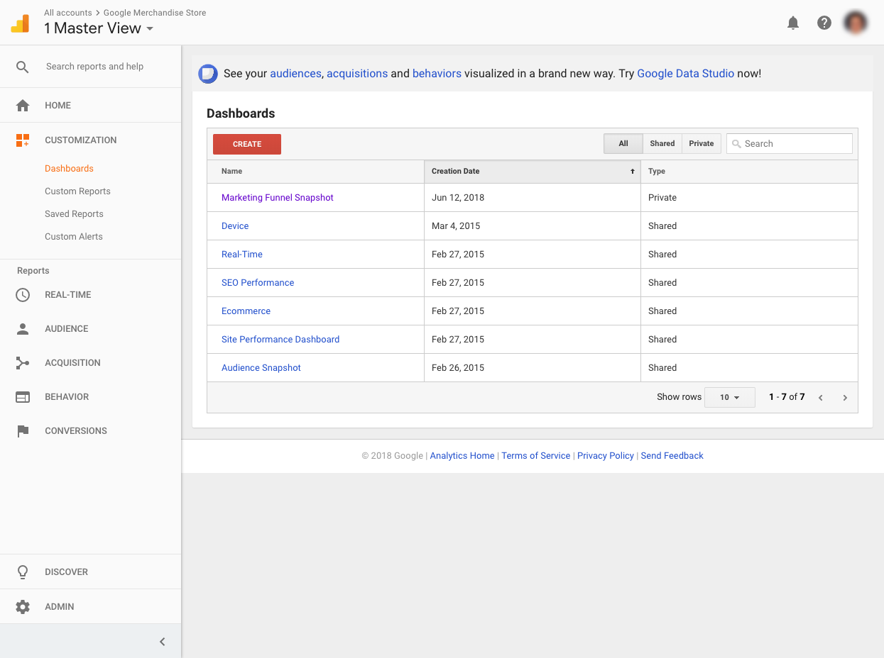
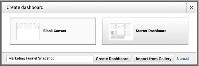
Click “Create”, select “Blank Canvas”, and name your dashboard. I’ve named mine “Marketing Funnel Snapshot”.
Note: It is worth exploring the dashboards available in the Gallery. The Google Analytics community has added hundreds of dashboards that you can use for your business. They vary widely in quality, but you might find inspiration or something relevant in there.
Step 2: Setup Awareness Metrics for Top of Funnel (TOFU)
Do you know how many new people you added to your marketing funnel last month? Do you have a sense for how many new people learned about you?
Your top-of-funnel metrics should give you a quick answer. It’s a never-ending battle to make more people aware of who you are and what you do. Without a regular stream of new people learning about you for the first time, your whole marketing funnel can languish. Sometimes a decrease in your TOFU stage has a delayed impact on your bottom line. For example, often it takes a month or two before a new visitor becomes a customer. So, if you have a major dip in your TOFU metrics, but you’re not monitoring them, the decrease in sales two months later might come as a surprise.
To approximate the health of the Awareness stage of your funnel, we’ll set up two metrics: New Visitors and New Visitor Channels.
Note: There are granular nuances around how Google Analytics defines a visitor vs. a user. The complexities are outside the scope of this guide, but if you’re interested in nitty gritty details, Optimize Smart has a great, highly detailed, guide.
It will look like this:
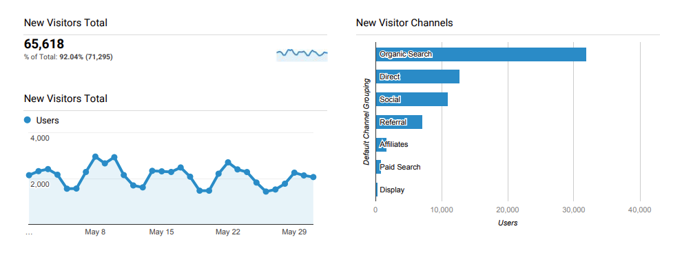
New Visitors
New visitors is shorthand for the top-of-funnel (TOFU) totals. This will include all new visitors from all channels – social, referrals, paid media, search, and offline.
Using this information, let’s create a metric total and timeline to show the same data.
Steps – add new visitors metric total:
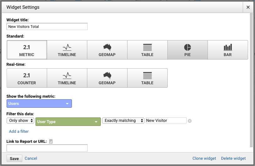
- Click +Add Widget and name it
- Select Standard > Metric
- Select “Users” for “Show the following metric:”
- Add this filter:
- Only show
- User Type
- Exactly matching
- New Visitor
Steps – add new visitor timeline:
- Click edit icon in the top right corner of the new visitor metric total widget
- Change “Metric” to “Timeline
With this data you’ll know:
- Are we bringing in new traffic consistently?
- Are we trending up or down?
- Are there any unexpected peaks or valleys in the data that we ought to investigate further?
New Visitor Channels
New visitor channels provide a snapshot of which channels are driving new people to your website. This will let you keep an eye on your key TOFU drivers.
We’ll create a bar chart to show the channel distribution.
Steps – add new visitor channels graph:
- Click +Add Widget and name it
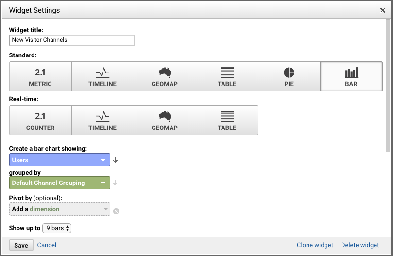
- Select Standard > Bar
- Select “Users” for “Create a bar chart showing:”
- Search for and select “Default Channel Grouping” for “grouped by”
- Change “Show up to” to “9 bars”
- Check “Use a horizontal version of this chart
- Add this filter:
- Only show
- User Type
- Exactly matching
- New Visitor
With this data you’ll know:
- What channels are driving traffic?
- Are there any channels that are under or over performing our expectations?
Step 3: Setup Evaluation Metrics for Middle of Funnel (MOFU)
Do you know how many new leads you got last month? How many people showed more than a passing interest in your organization and what you do?
It’s not enough that people go to your site. High traffic volume won’t move your business goals forward unless users are also taking action. They need to give you permission to talk with them. Is your marketing driving enough interest in what you’re doing to engage people and compel them to take the next step.
The two metrics we’ll use for the dashboard for MOFU are Returning Visitors and New Registrations.
It will look like this:
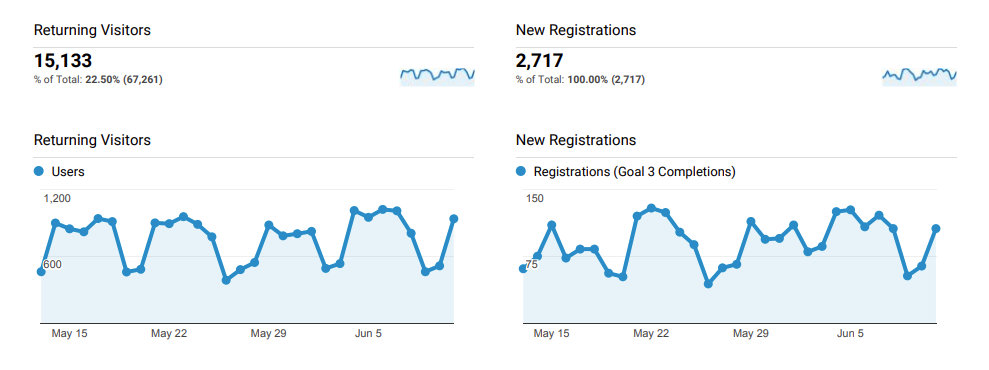
Returning Visitors
This metric measures how well you’re engaging your audience and bringing them back to your site.
You may have heard of The Rule of Seven. The Rule of Seven states that, on average, someone needs to see your marketing messages at least seven times before converting. After all, it takes time for potential customers to build enough trust to make a decision.
It also means that a critical part of your funnel is making sure you’re getting people to return to your site. That’s what this metric approximates.
Steps – add returning visitors metric total:
- Click +Add Widget and name it
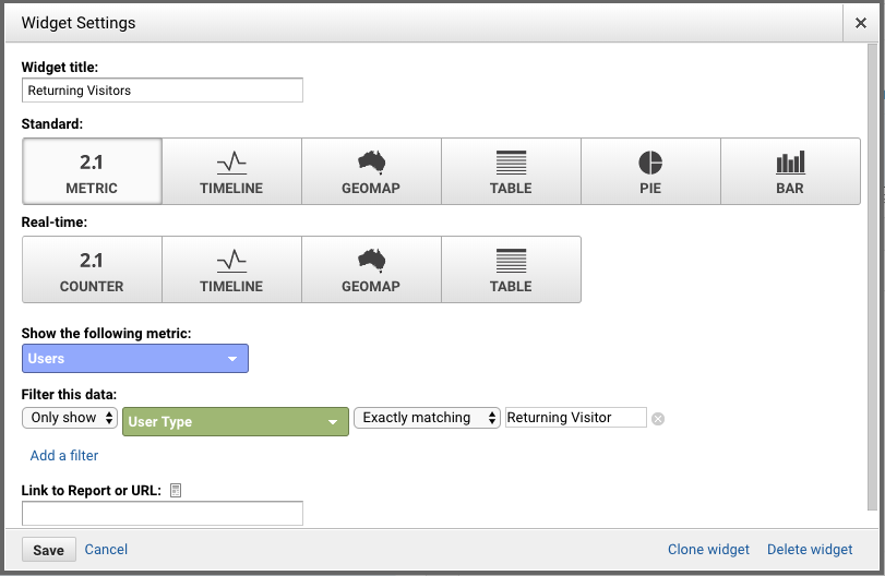
- Select Standard > Metric
- Select “Users” for “Show the following metric:”
- Add this filter:
- Only show
- User Type
- Exactly matching
- Returning Visitor
Steps – add return visitor timeline:
- Click edit icon in the top right corner of the new visitor metric total widget
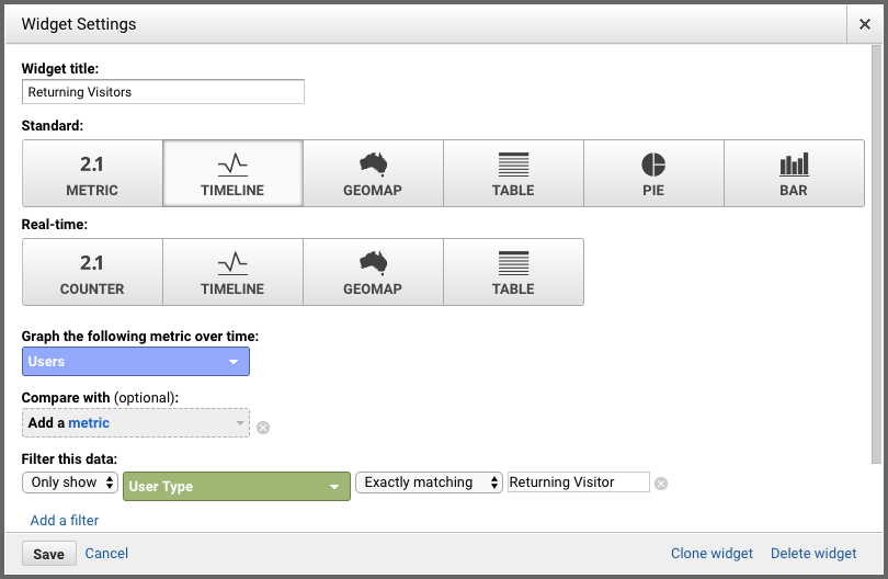
- Change “Metric” to “Timeline
With this data you’ll know:
- Are we engaging enough that people return to our site?
- Are our marketing efforts attracting warm audiences (people who have heard of us before?) or only people who are new to us?
- Are we trending up or down?
- Do our return visitor metrics mirror new visitor metrics?
New Registrations
I’ve labeled this widget “New Registrations”, because that’s the name of the goal in Google’s Demo Account data set. Really, this is a placeholder for “New Leads”, whatever that means for your organization.
In order to get this data, you need a Google Analytics goal set up for whatever you consider to be a lead. If you don’t yet have a goal setup to track lead acquisition, do that now. Google has a handy guide here: https://support.google.com/analytics/answer/1032415?hl=en
If you’ve not yet set up goals for the most important actions on your site, do that as soon as possible. Having goals dramatically improves you data and your ability to extract actionable information from Google Analytics.
Steps – add new registrations/new leads metric total:
- Click +Add Widget and name it
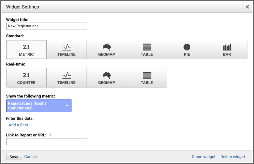
- Select Standard > Metric
- Select your key lead goal for “Show the following metric:” and choose the “completions” option; If you’re using the Google demo account, choose “Registrations (Goal 3 Completions)”
Steps – add new registrations/new leads timeline:
- Click edit icon in the top right corner of the new visitor metric total widget
- Change “Metric” to “Timeline
With this data you’ll know:
- Are we growing our lead list consistently?
- Do our lead trends mirror new or returning traffic trends?
- How many leads did we add in the last month?
Step 4: Setup Conversion Metrics for Bottom of Funnel (BOFU)
This step will help you decipher if you are closing sales and bringing in money.
To the degree it’s possible for your organization, you should get transaction information into Google Analytics. In the same way that having goals set up for lead generation can help determine whether you’re attracting the right traffic, having goals set up for transactions can help determine whether you’re attracting the right leads.
It might not be practical for your organization to get your BOFU metrics into Google Analytics. Maybe there’s no reliable way to tie your marketing activity to a specific transaction. Pharmaceutical companies can’t know if users wound up asking their physician for a particular product, for example. Maybe that data lives in another platform, such as a separate CRM, for instance, that doesn’t make sense to pull into Google Analytics.
You can pull in offline sales into Google Analytics, but it normally requires a CRM and advanced configuration. For example, here’s a guide from LunaMetrics that digs into how to integrate Google Analytics and Salesforce.
That’s outside the scope of this guide, but worth exploring if it makes sense for your business.
For this guide, we’ll continue with the Google demo data set which reflects an ecommerce business. We’re highlighting two metrics: Sales and Average Order Value.
It will look like this:
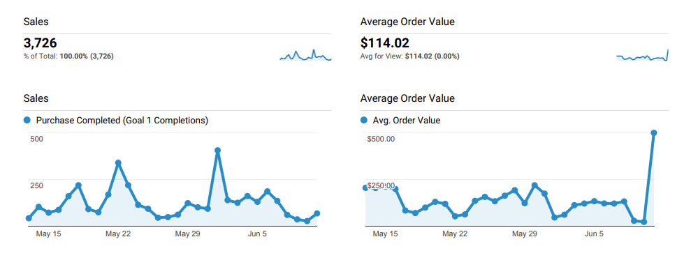
Sales
Tracking your sales properly requires goals. If you’re selling products on your site, you should also set up Ecommerce tracking. The details there are beyond the scope of this guide, but you can start with Google’s guide here: https://support.google.com/analytics/answer/1009612?hl=en
Steps – add sales metric total:
- Click +Add Widget and name it
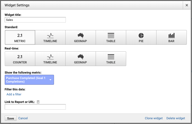
- Select Standard > Metric
- Select your key sales goal for “Show the following metric:” and choose the “completions” option; If you’re using the Google demo account, choose “Purchase Completed (Goal 1 Completions)”
Steps – add sales timeline:
- Click edit icon in the top right corner of the new visitor metric total widget
- Change “Metric” to “Timeline
Average Order Value
Not all customers are created equal and not all transactions are the same. Keeping an eye on your average order value can give you a sense for the type of customers you’re attracting and how well you’re maximizing the initial revenue you pull in.
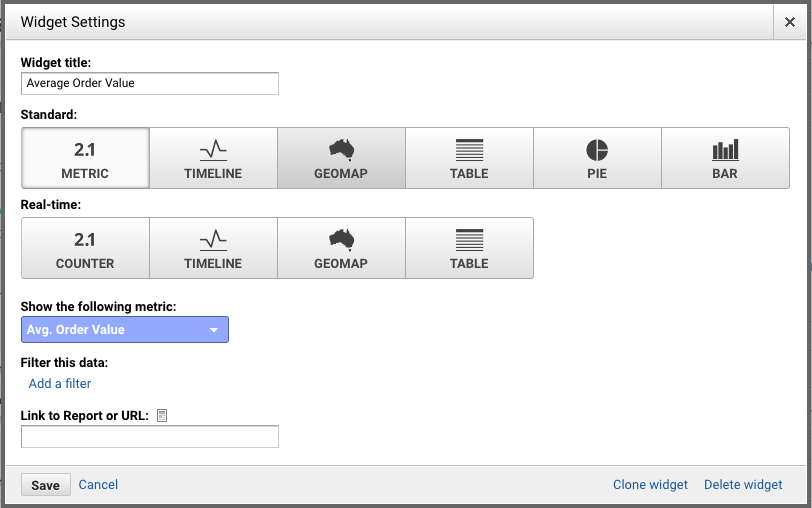
Steps – add average order value metric total:
- Click +Add Widget and name it
- Select Standard > Metric
- Select “Avg. Order Value” for “Show the following metric:”
Steps – add average order value timeline:
- Click edit icon in the top right corner of the new visitor metric total widget
- Change “Metric” to “Timeline
The ‘One Metric That Matters’ Principle
In their book Lean Analytics, Alistair Croil and Ben Yoskovitz popularized the concept of the One Metric That Matters. The idea is that an organization or team should pick one, actionable metric that your organization is laser-focused on improving.
The benefit of reducing your organization’s focus is clarity. Sure, you lose nuance, but that’s not always a bad thing. It’s more productive to focus on doing one or two things really well than trying to focus on everything.
Using a Google Analytics dashboard as described above can be a great way to track your funnel over time and make incremental improvements. For each step in your sales funnel, determine your One Metric That Matters (OK, maybe two if you really need both). Focus on improving this metric day in and day out. This will help you determine success. That said, don’t feel locked into using a Google Analytics custom dashboard. You may find that something like Google’s Data Studio or Databox serves your needs better. You may even find that it’s easier to maintain a spreadsheet or a weekly one-page report makes more sense for your organization.
Whatever you decide, I encourage you to do three things:
- Explicitly define and consider each step of your funnel.
- Err on the side of choosing fewer high-level metrics.
- Make sure the the Google Analytics data you are getting is clean and accurate
It is critical that your organization regularly monitor metrics that matter. It’s also critical that your analytics are set up correctly and configured to help you make smart business decisions and get advanced notice of red flags.
Mightybytes can help you sort through your data and structure your reporting. If your organization needs to make more sense of your analytics and determine the metrics that matter for you at each step in your funnel, click here to contact us and tell us how we might help.